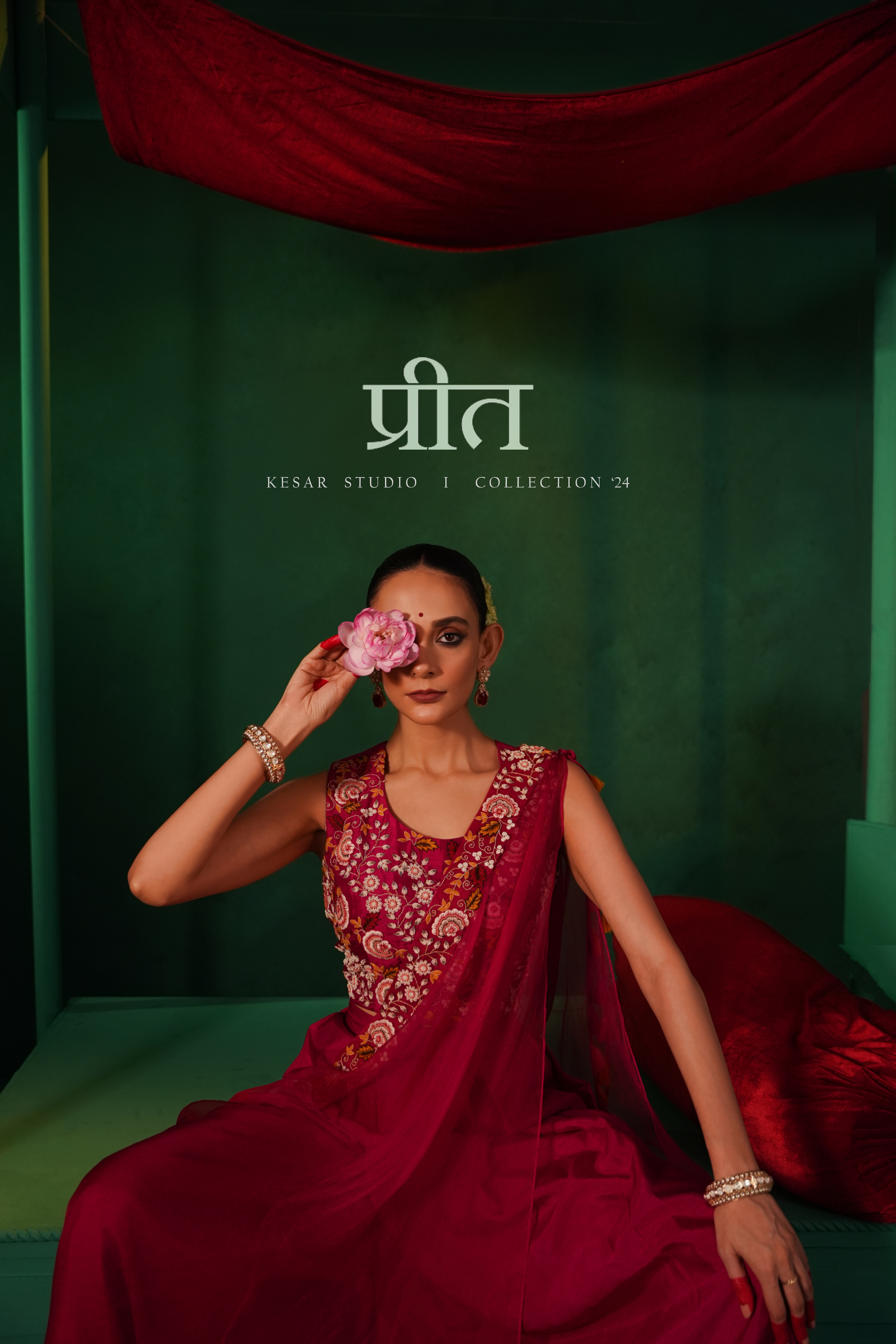
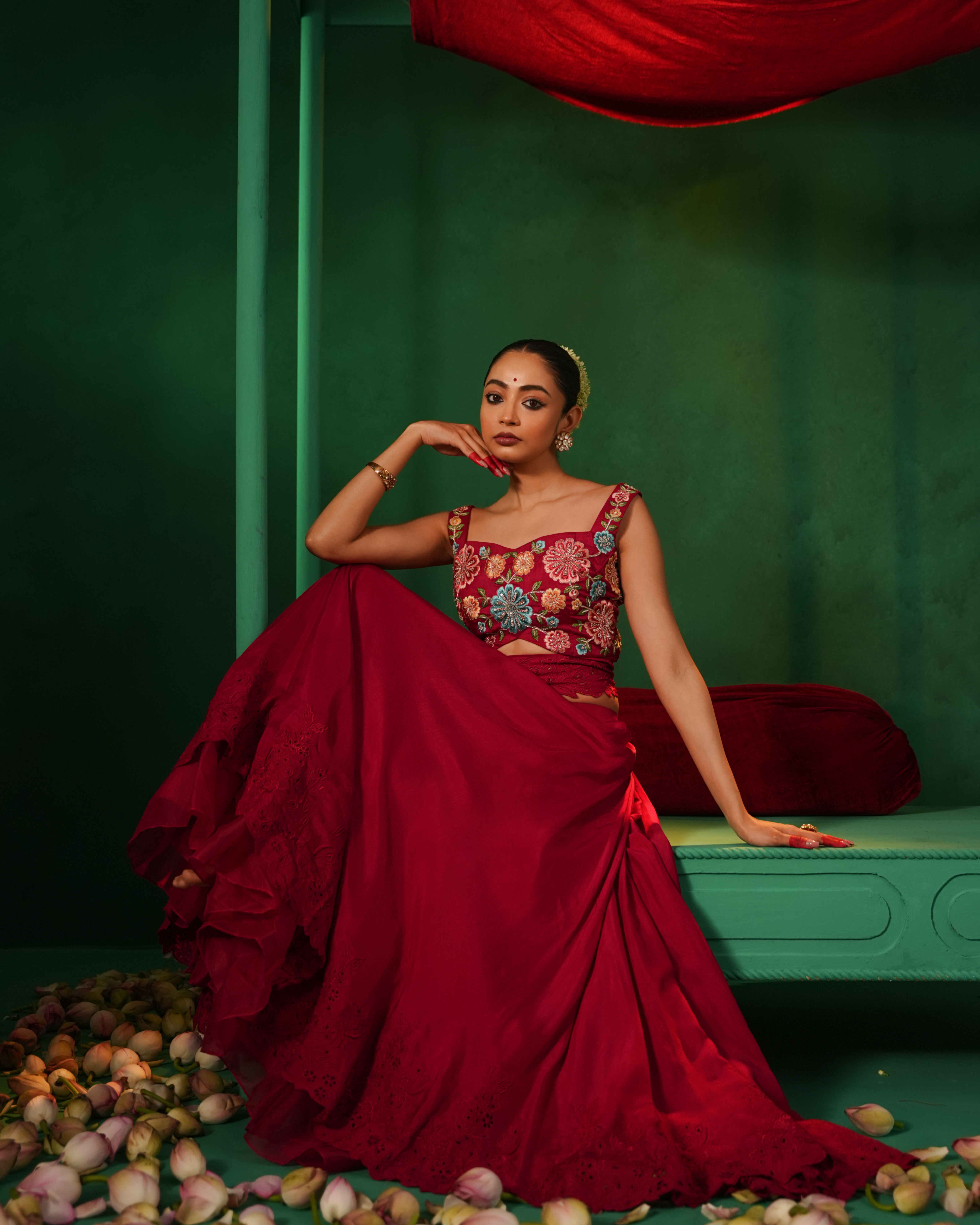
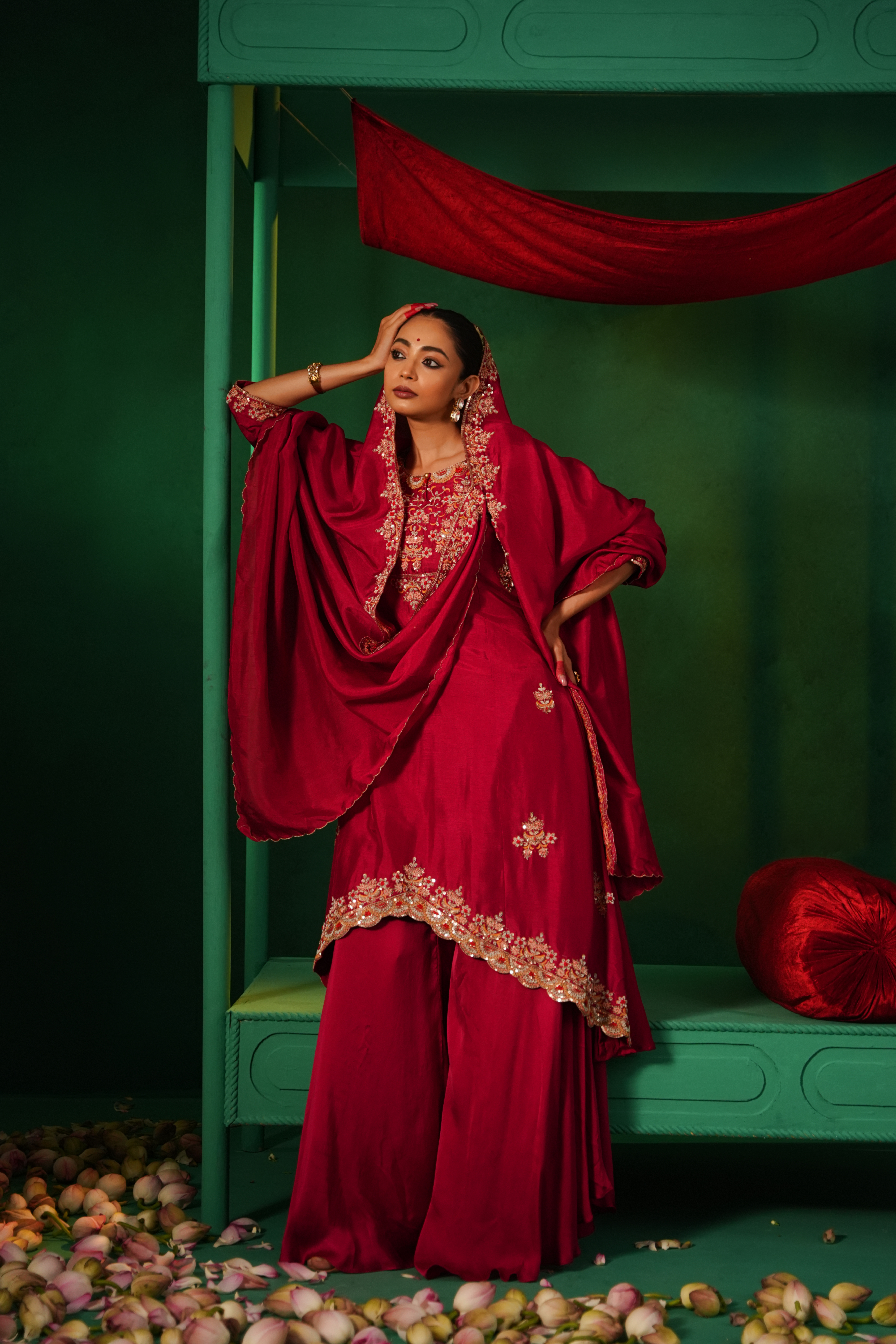
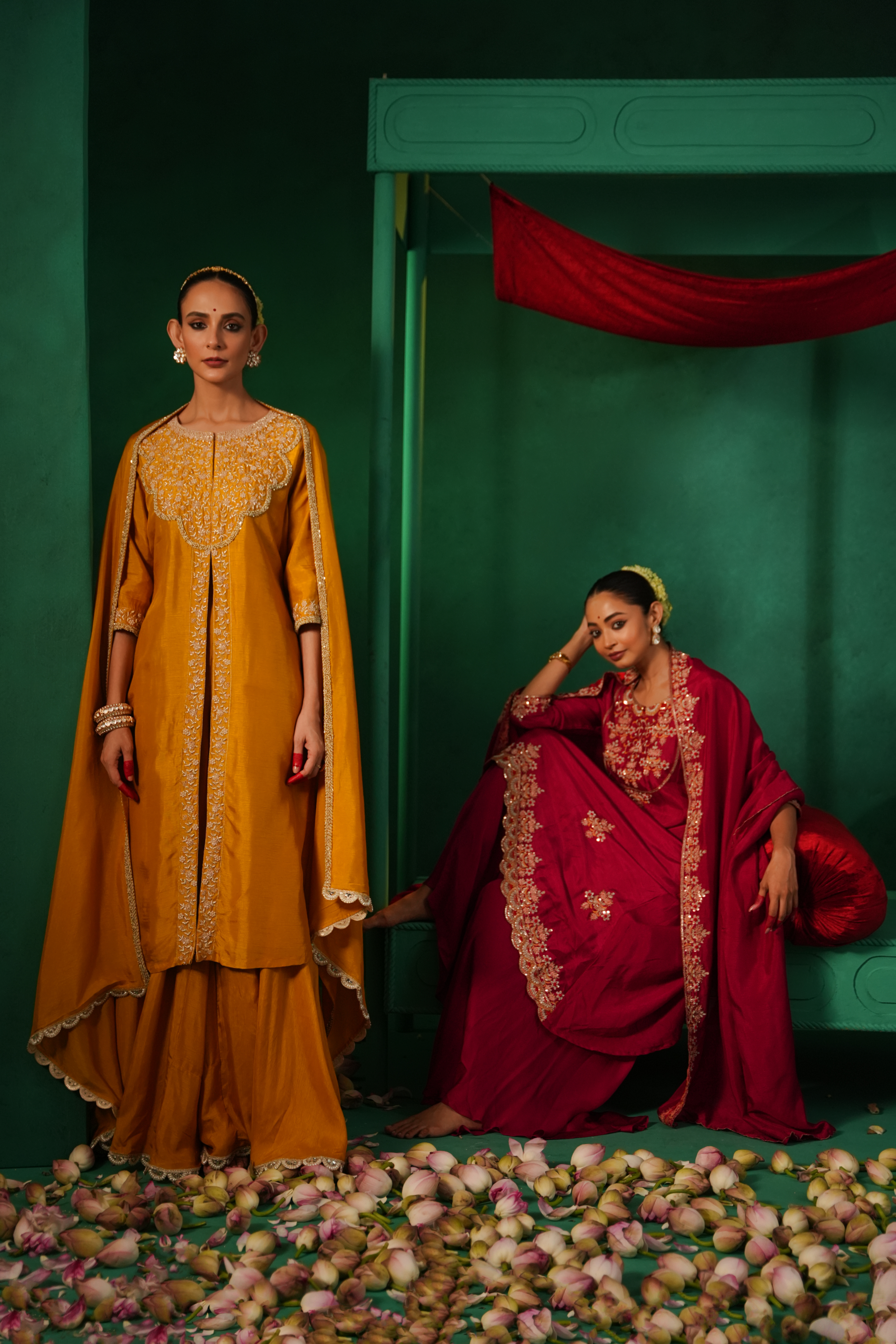
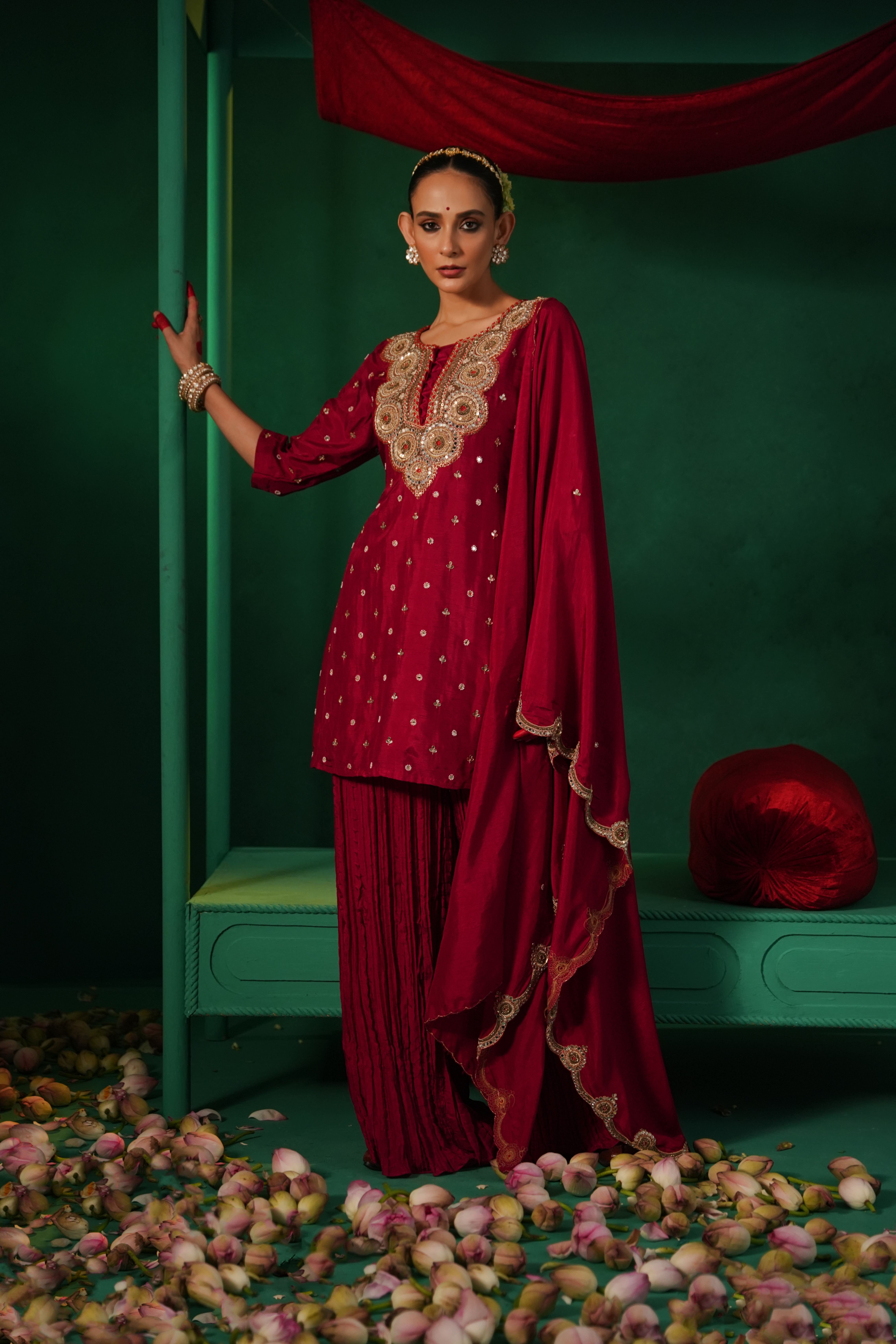
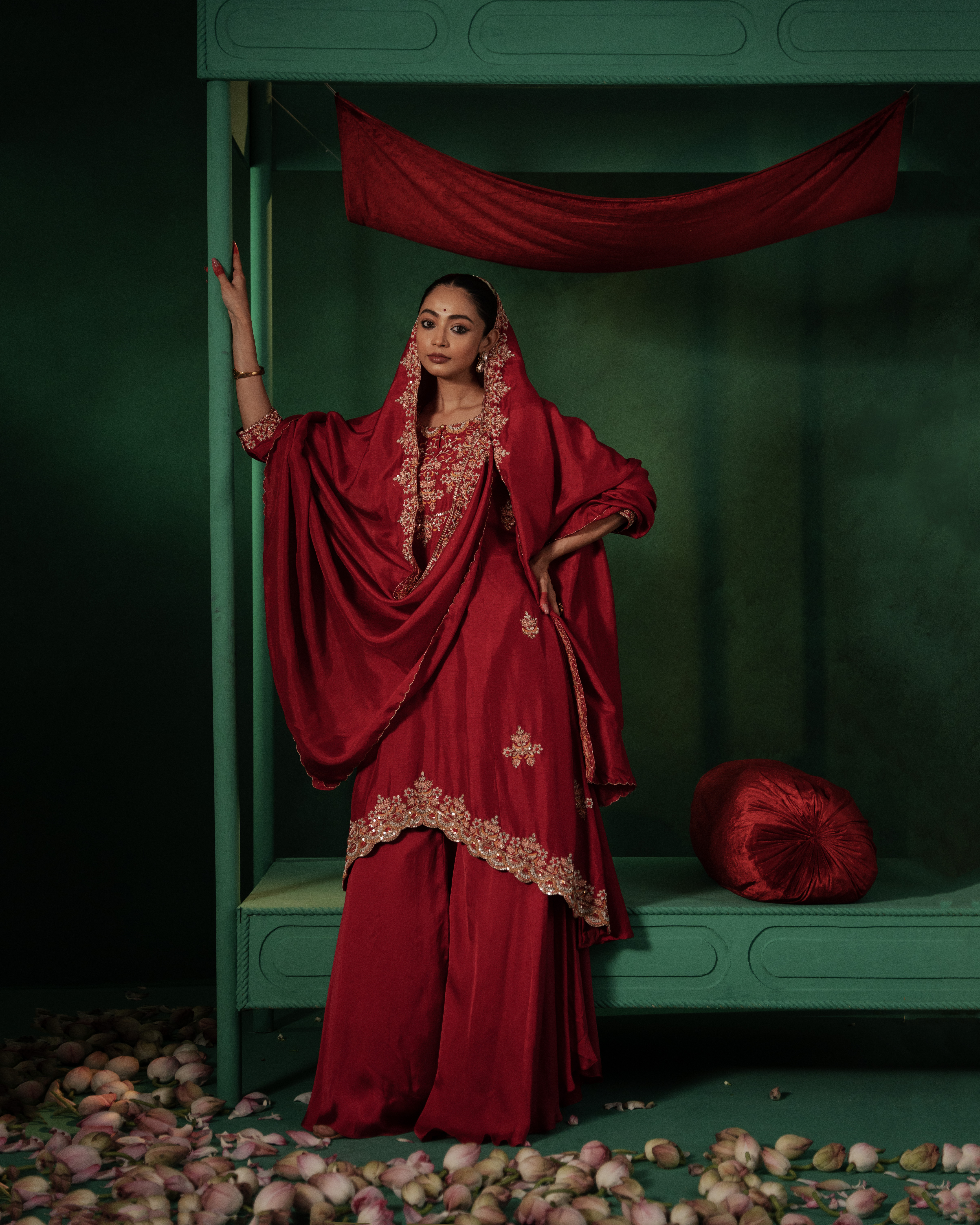
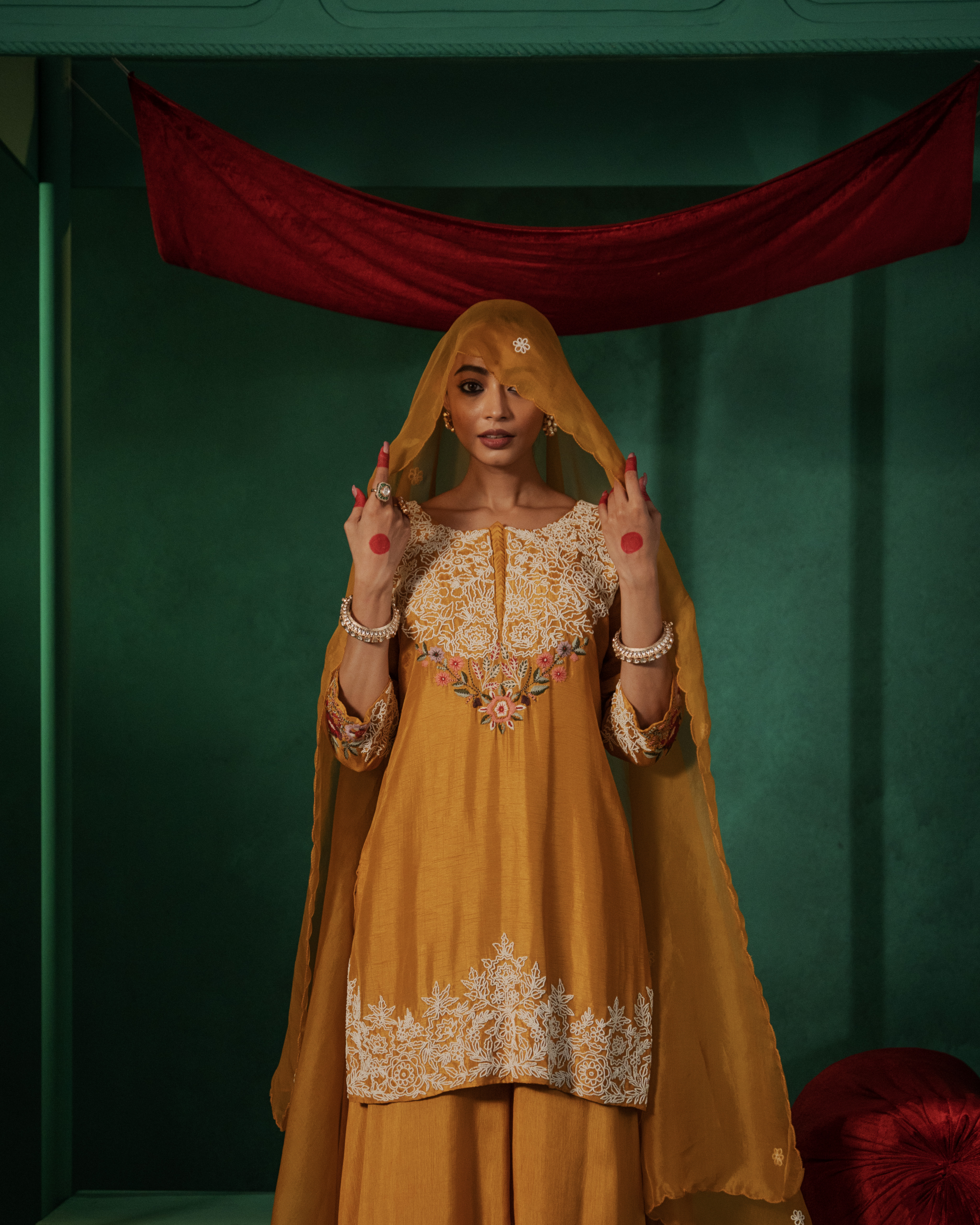
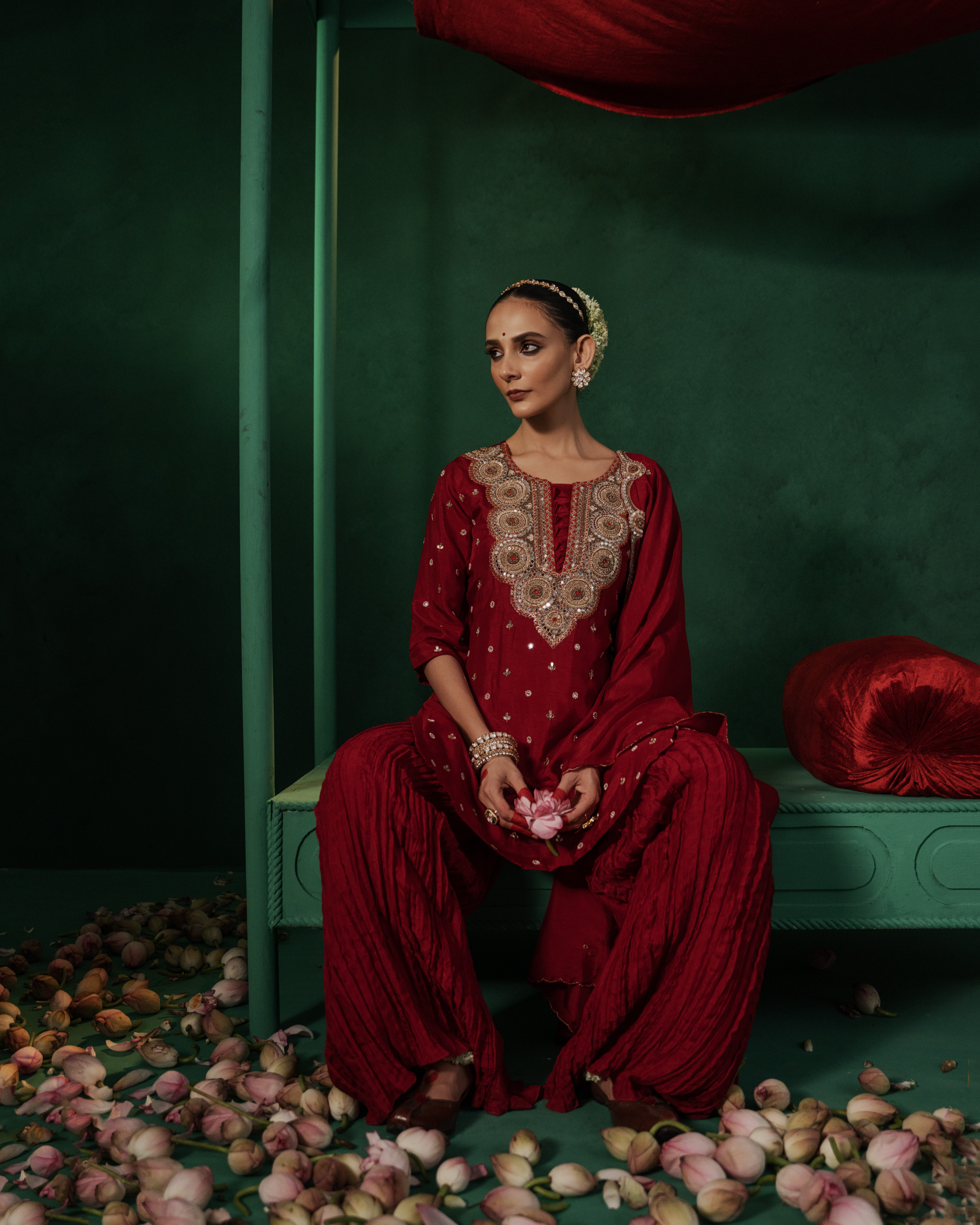
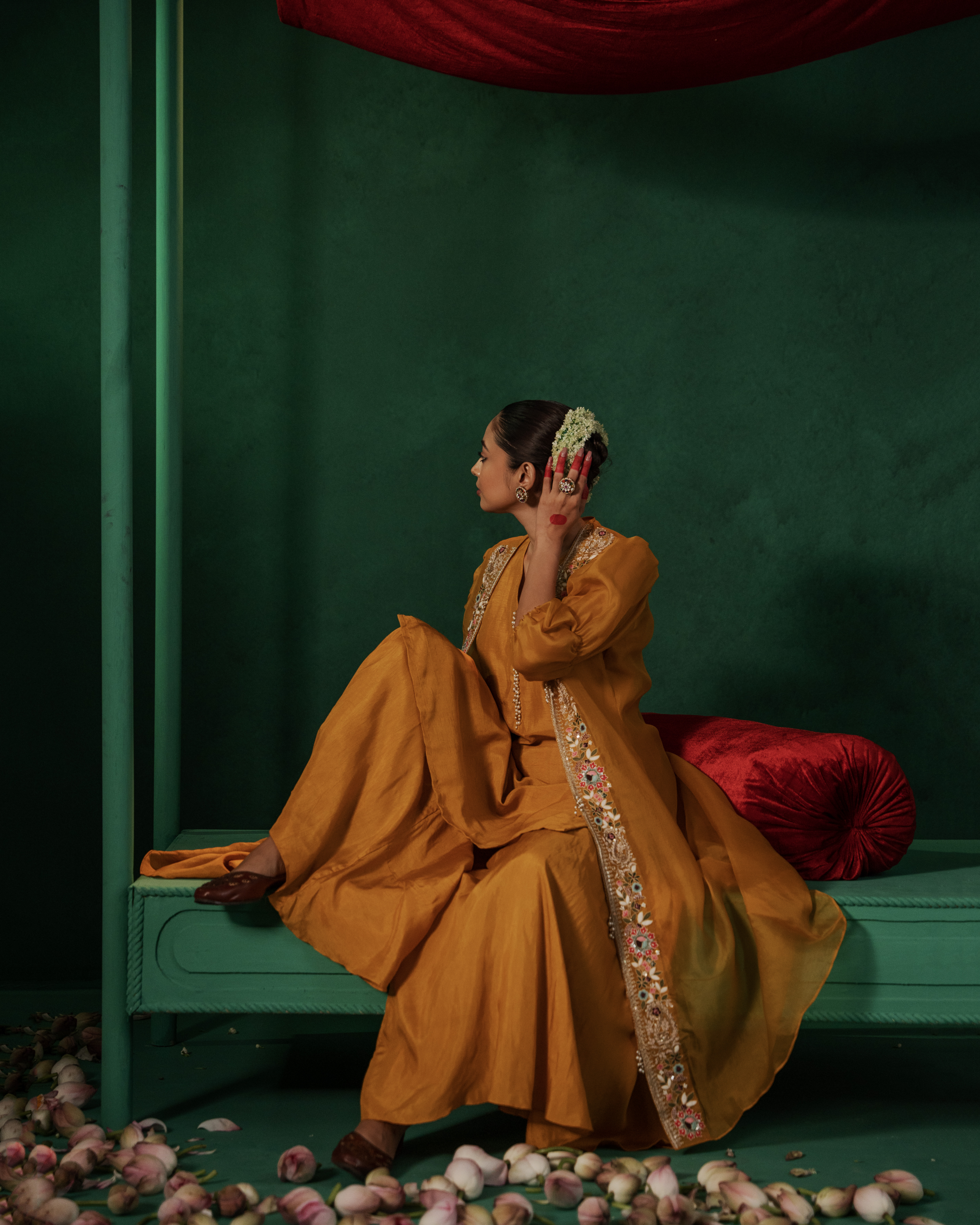
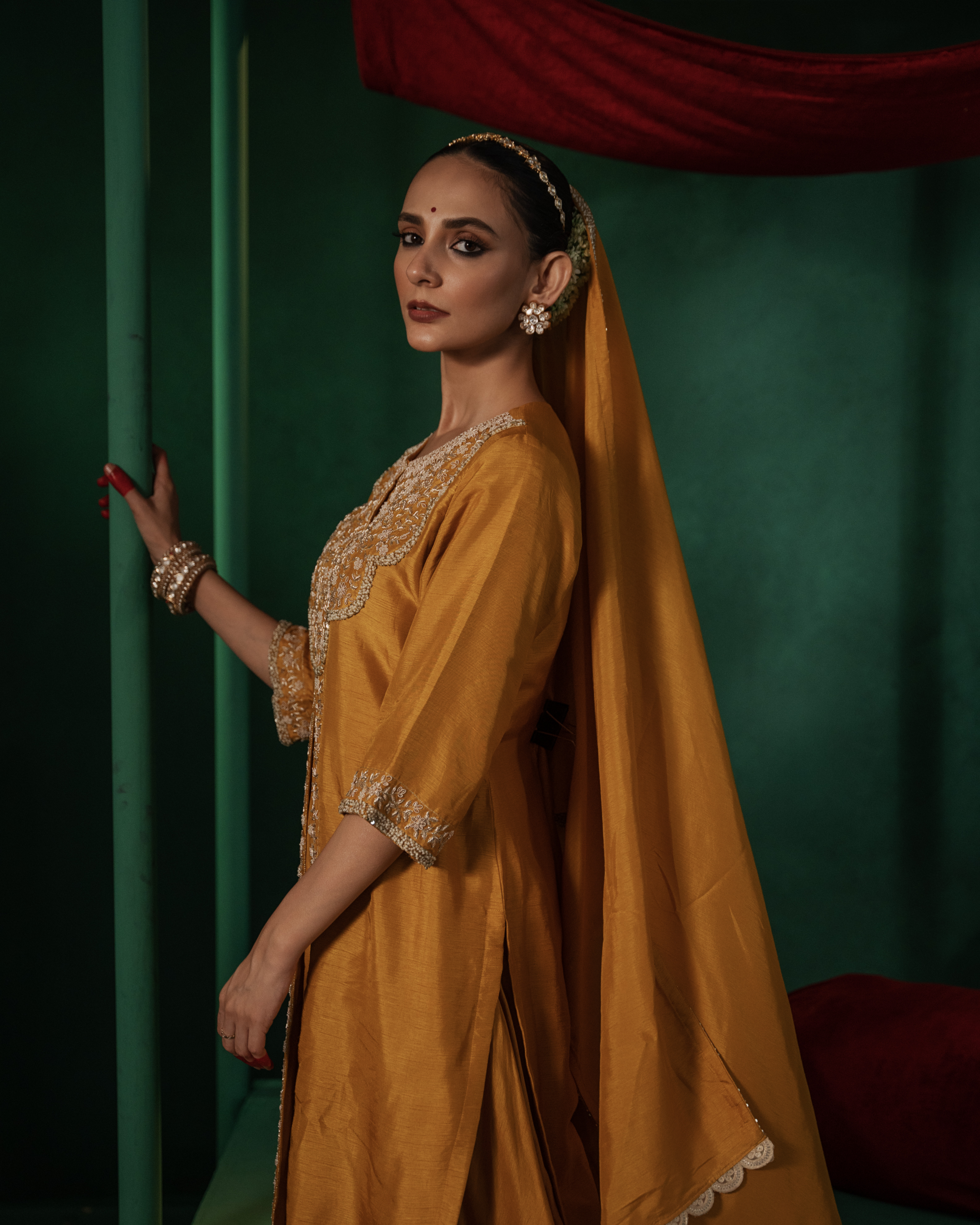
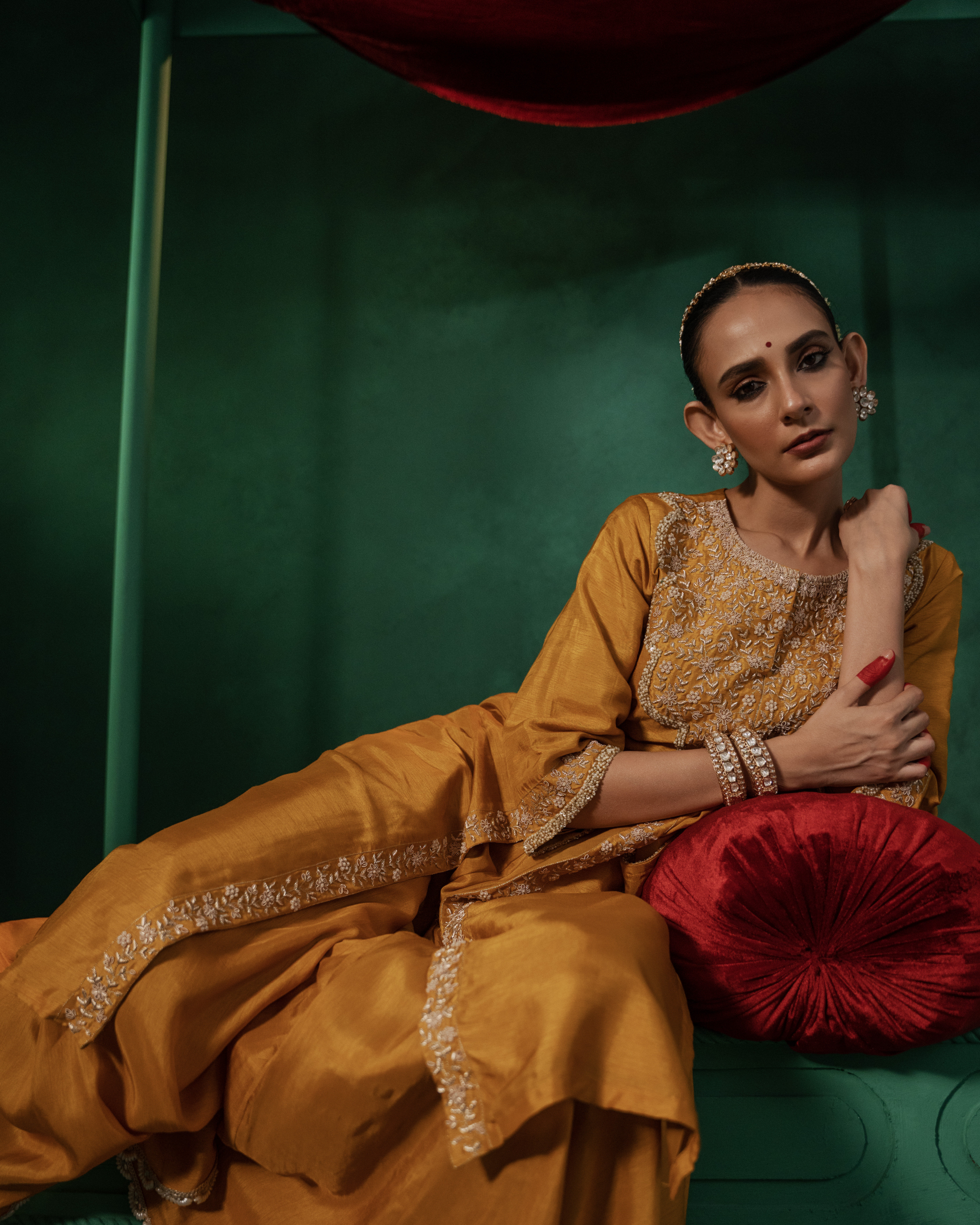
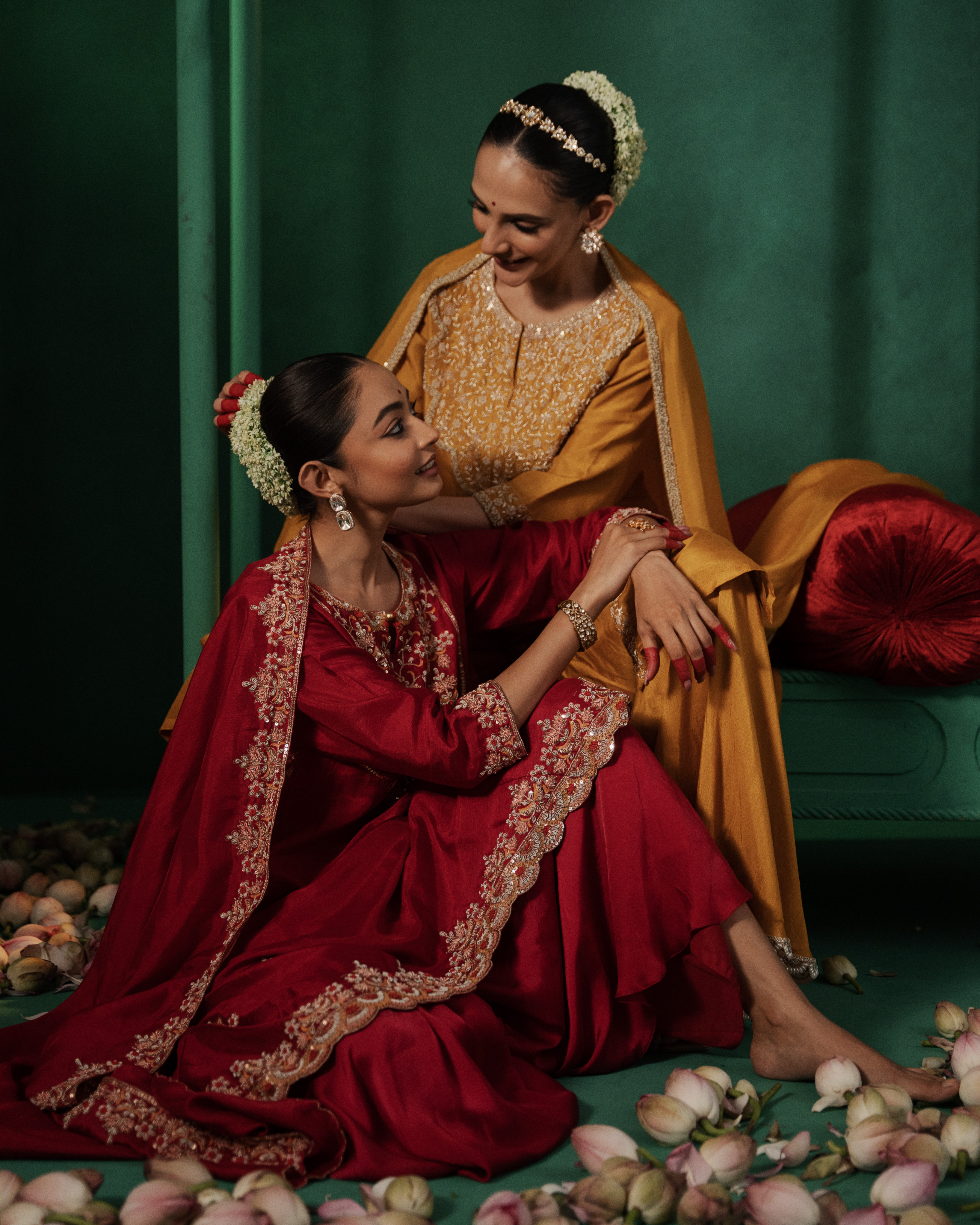
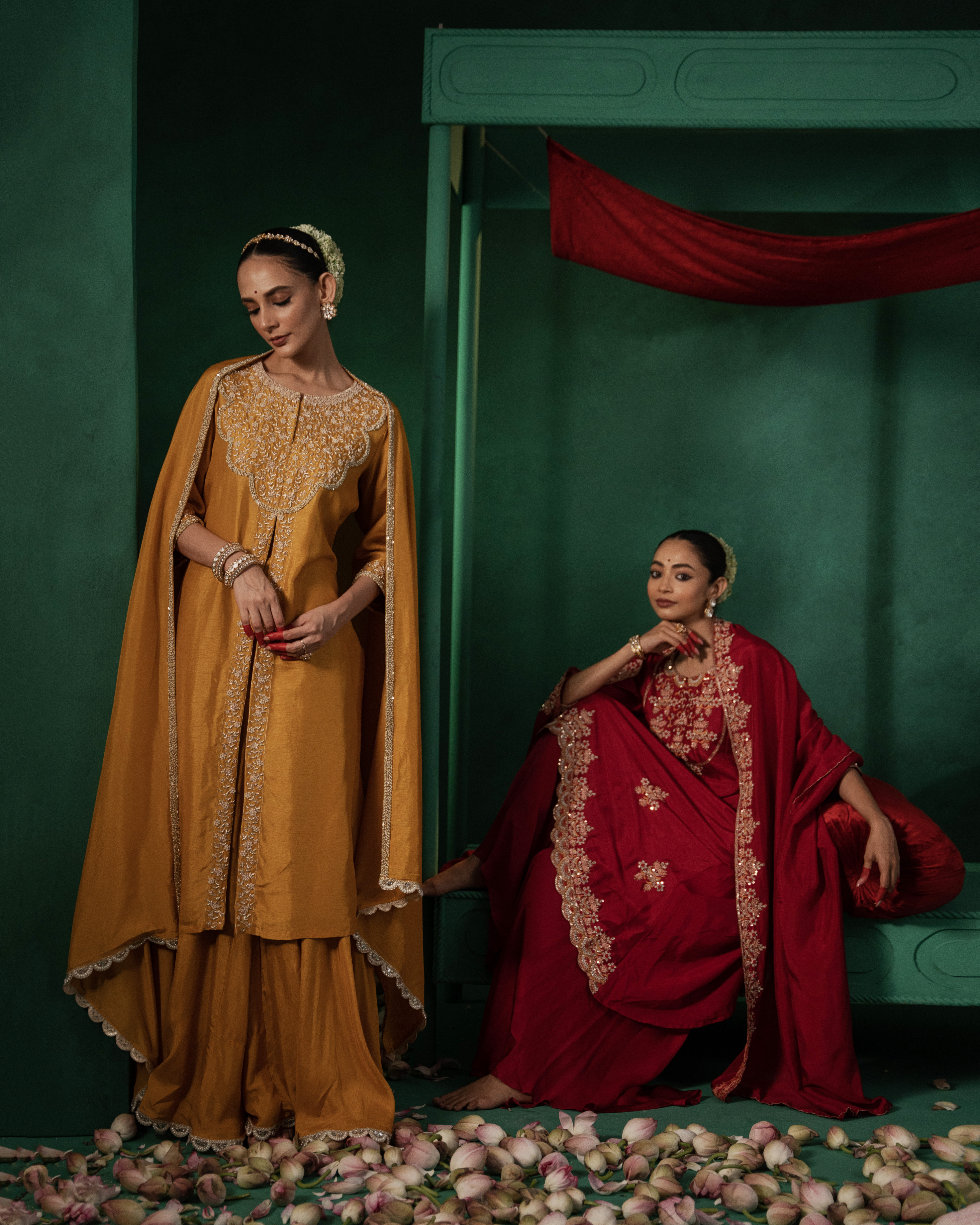
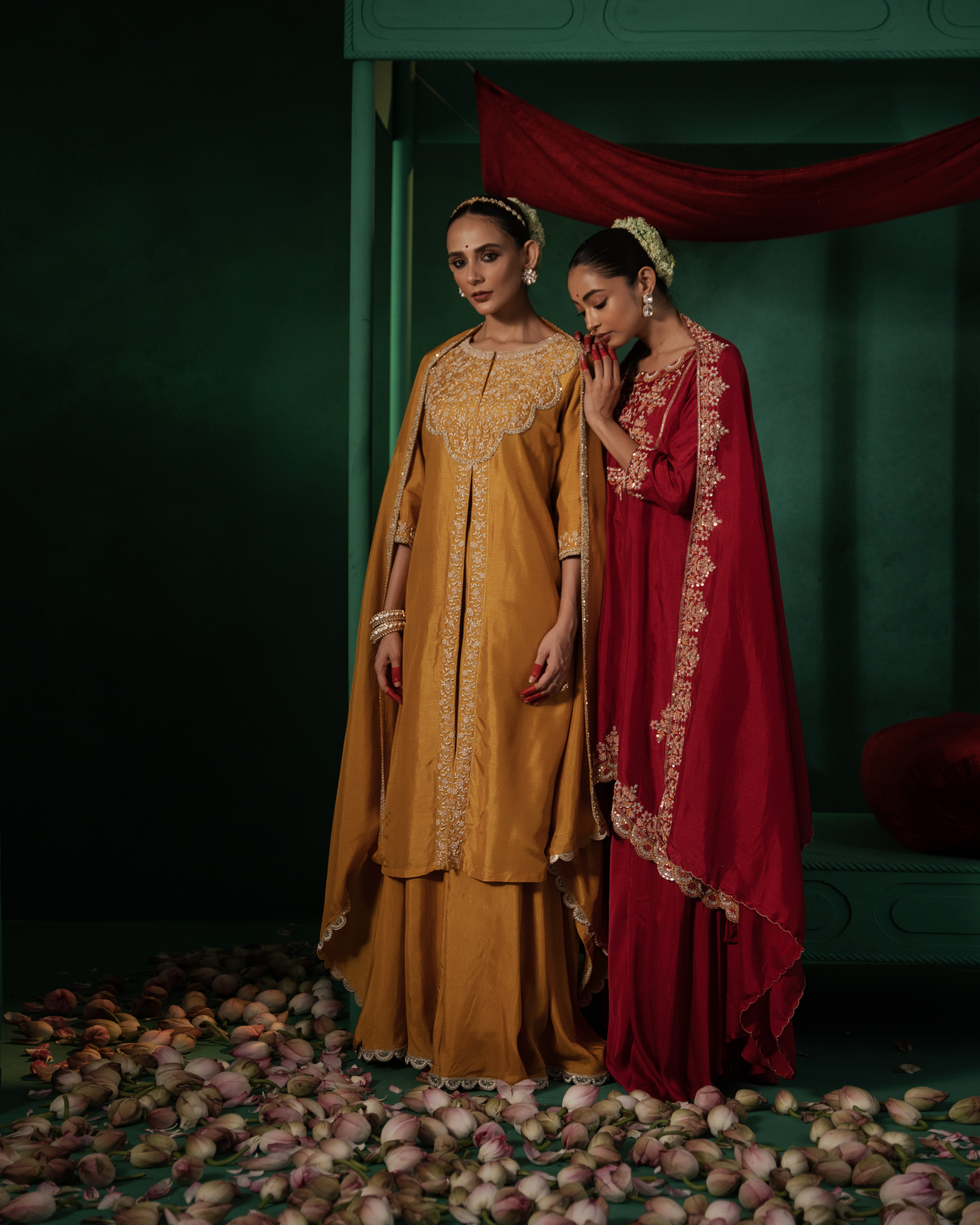
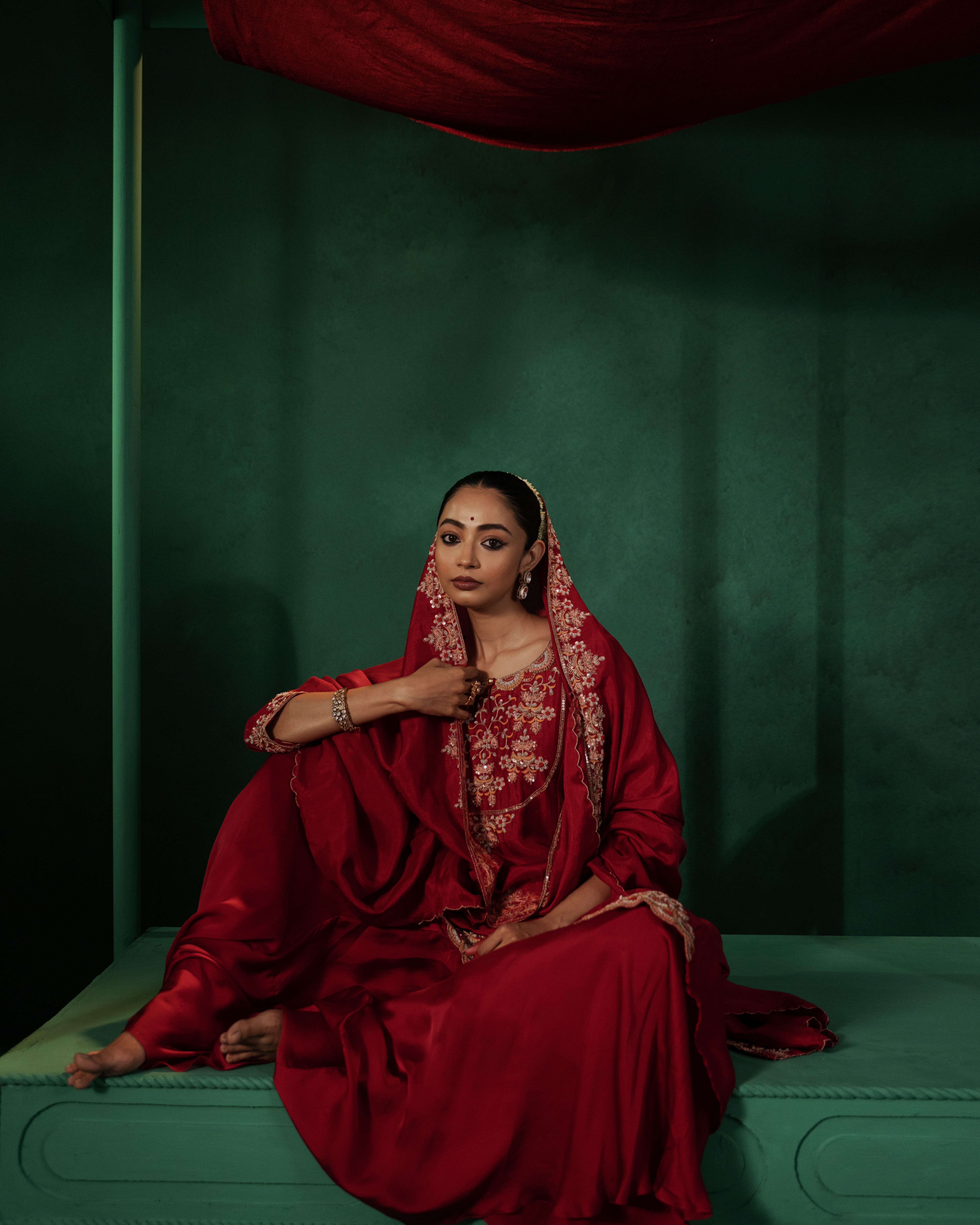
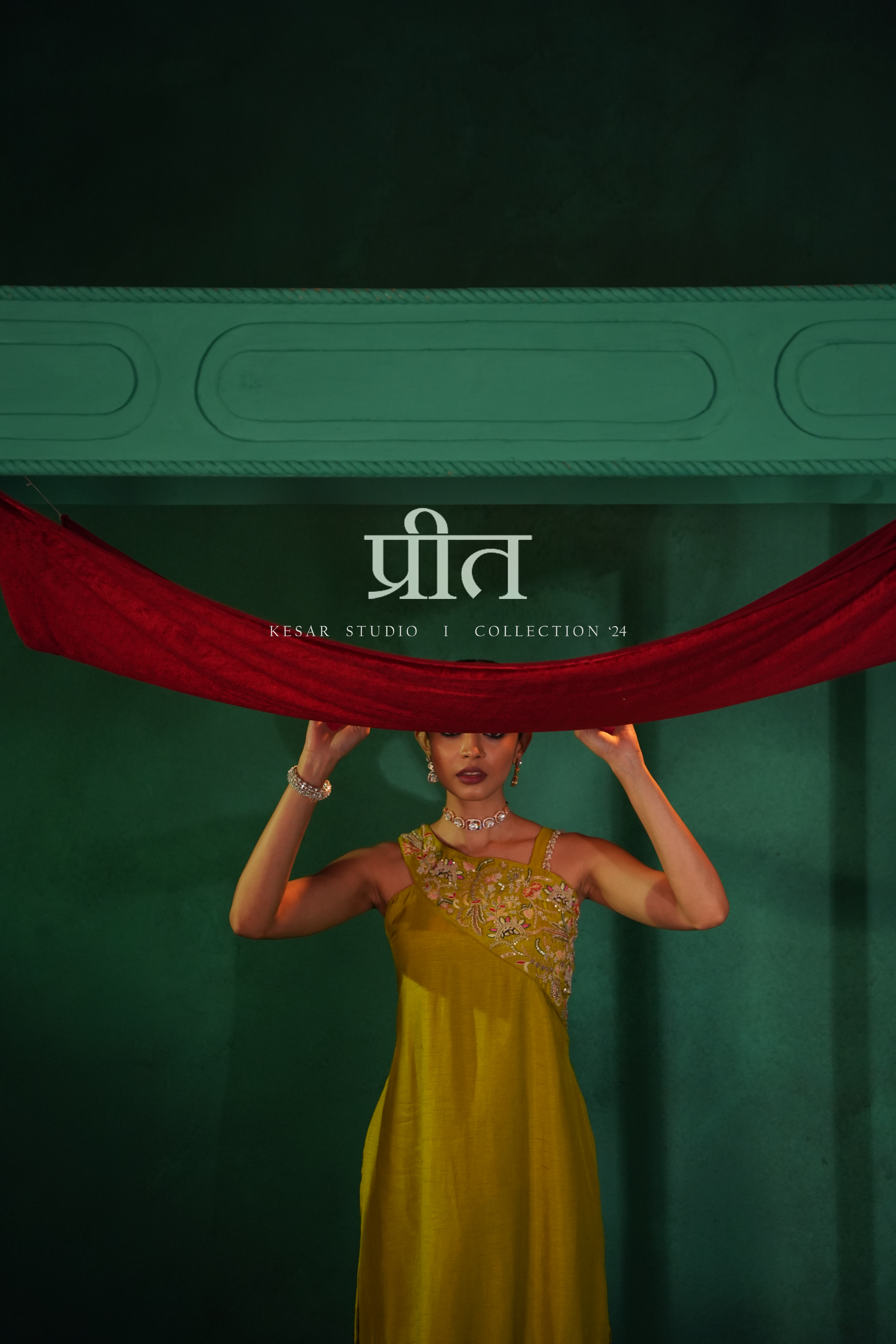
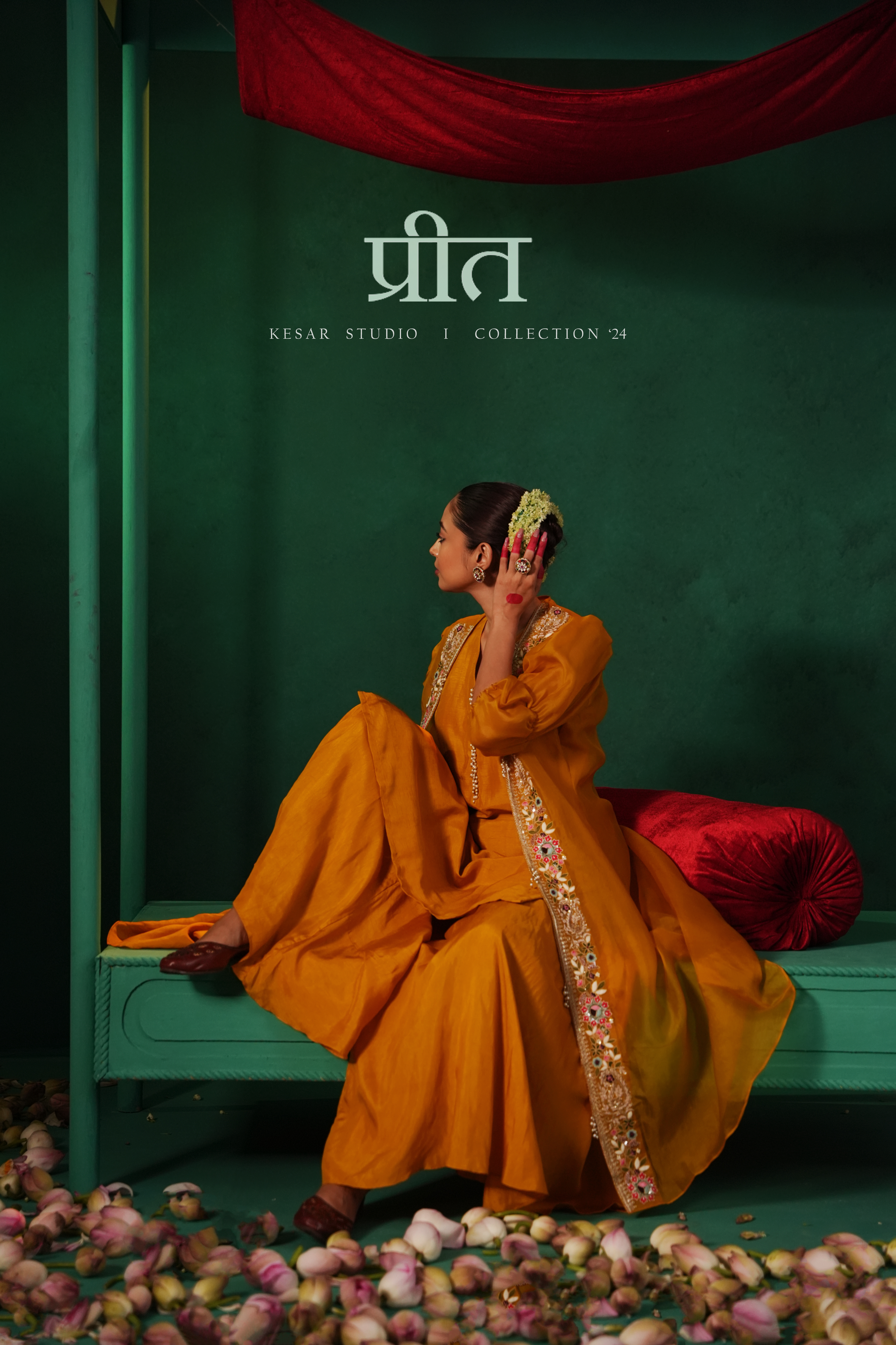
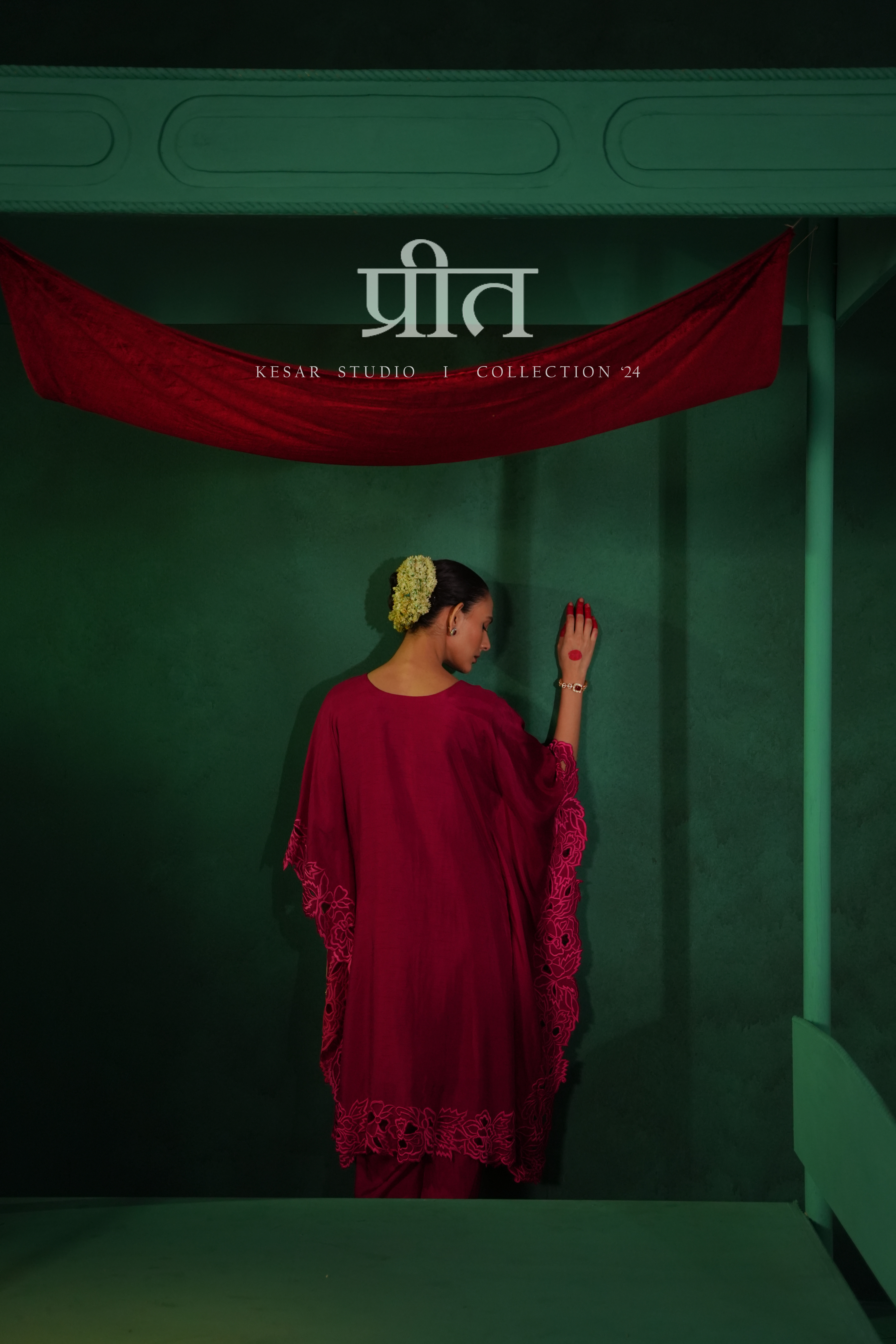
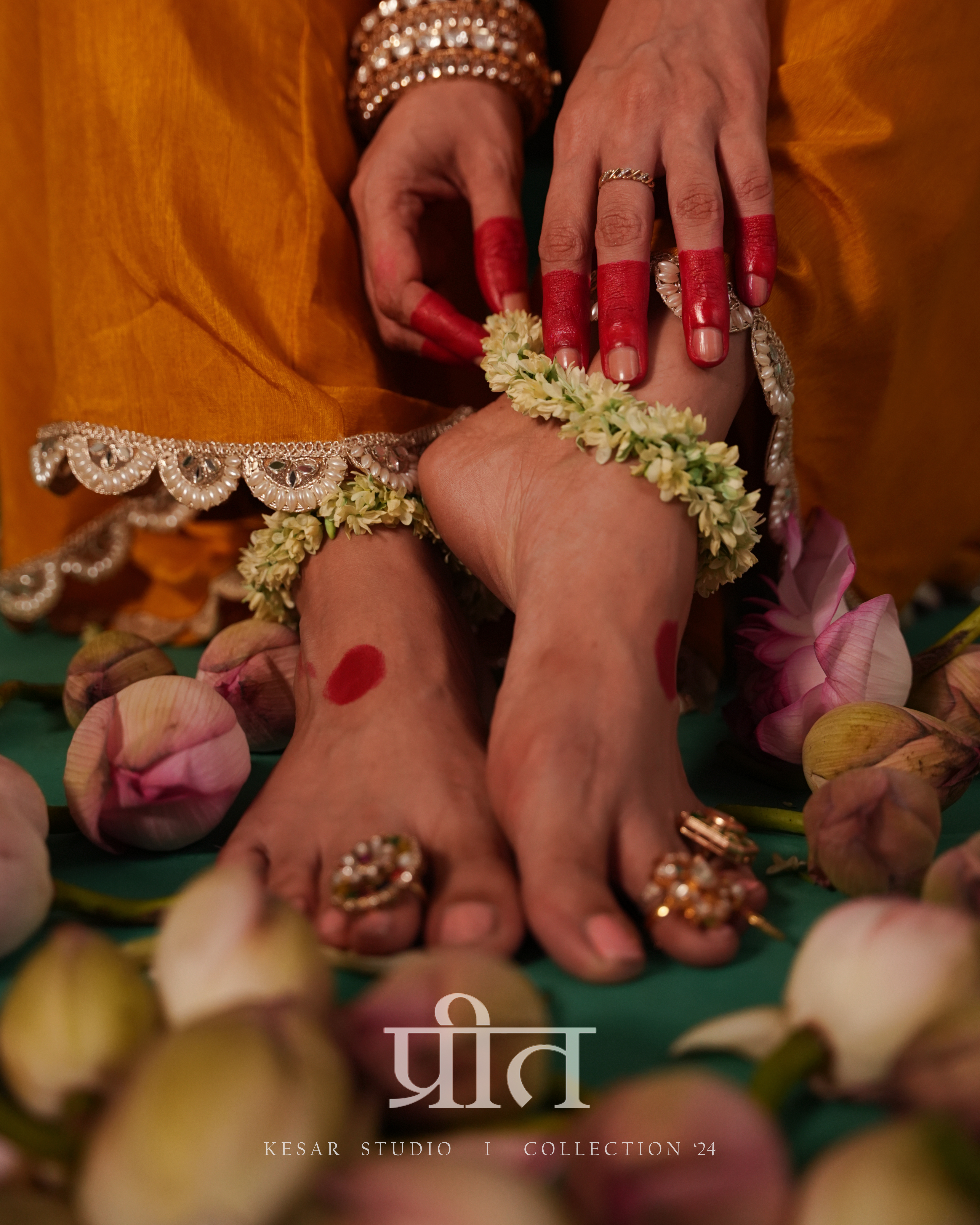
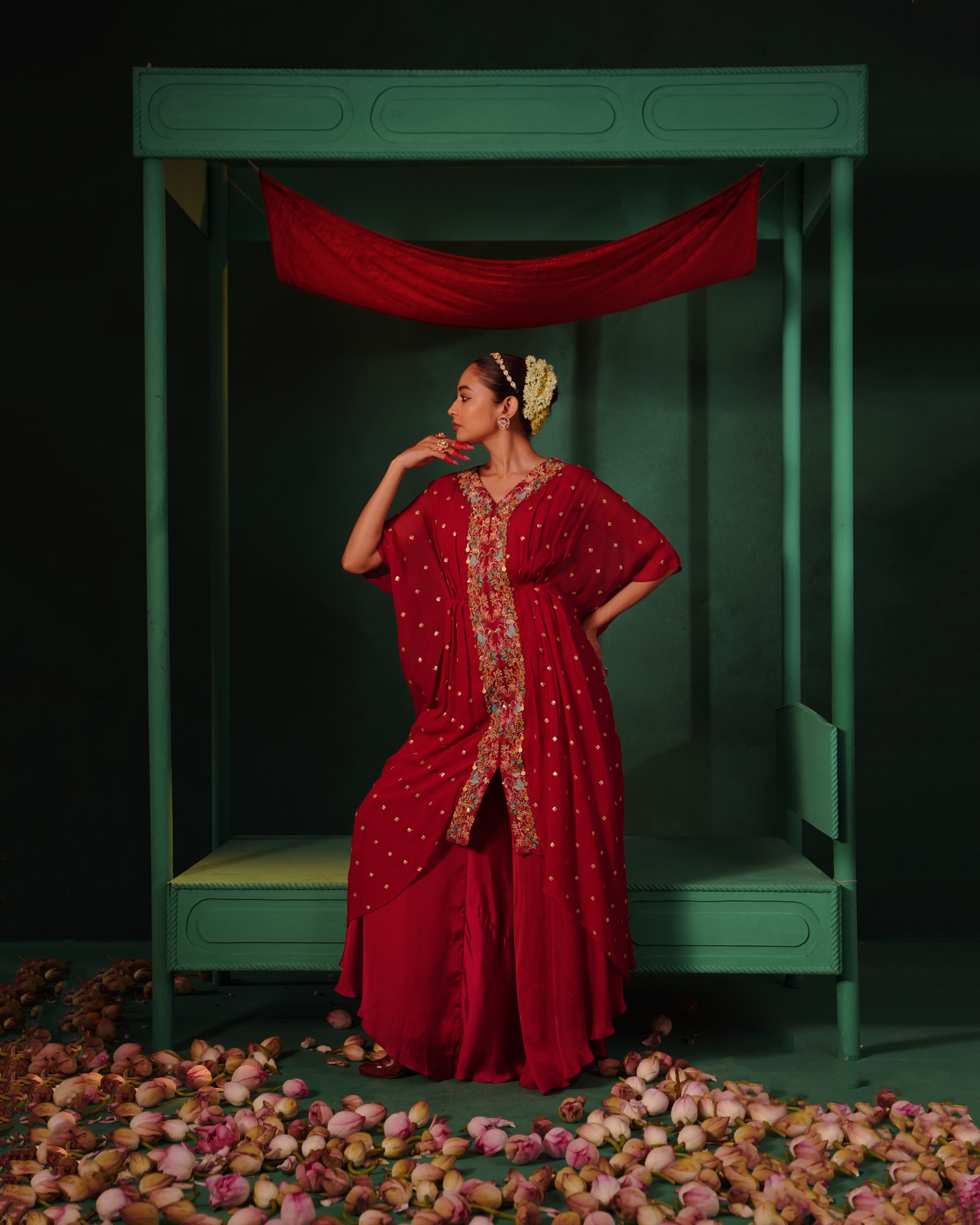
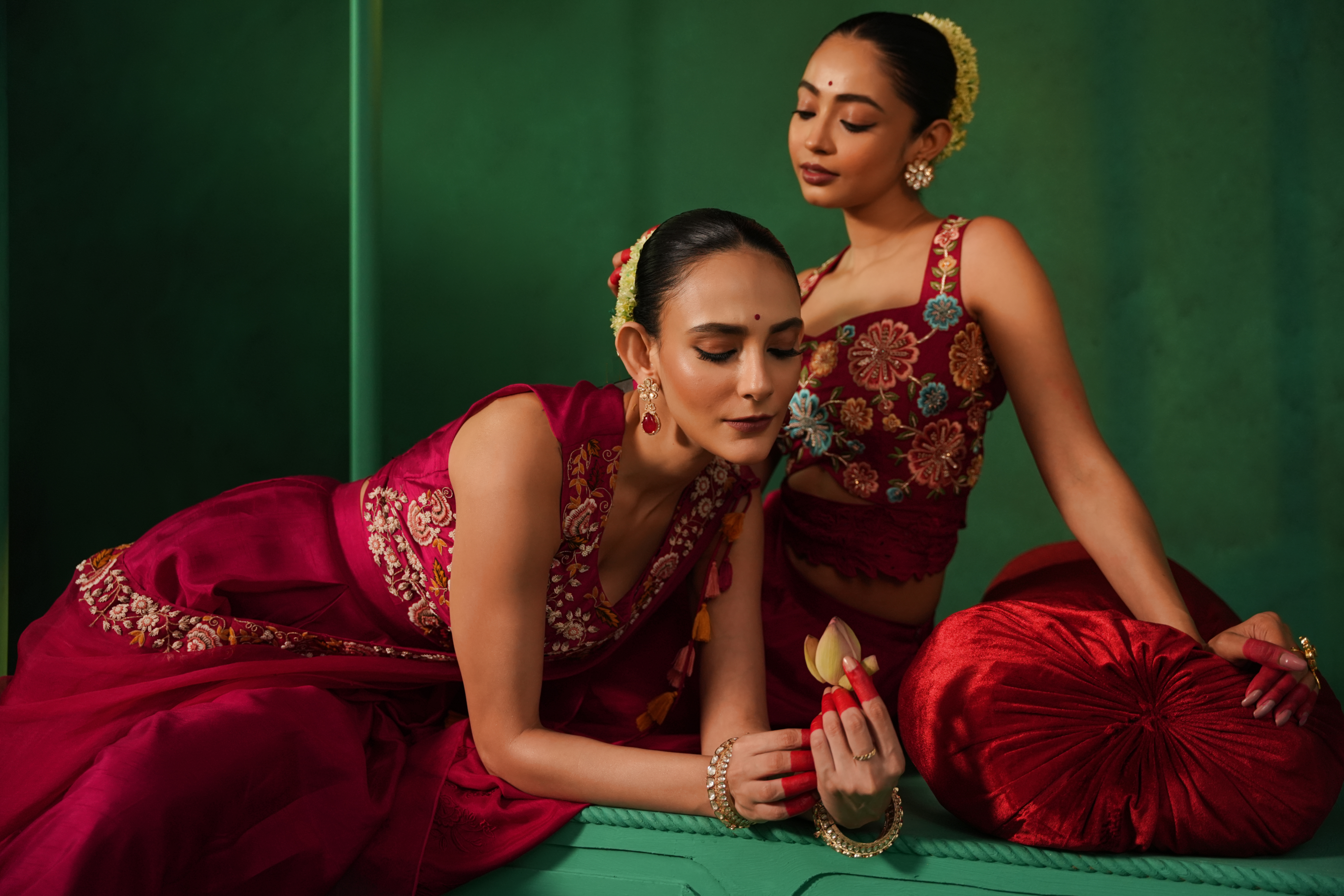
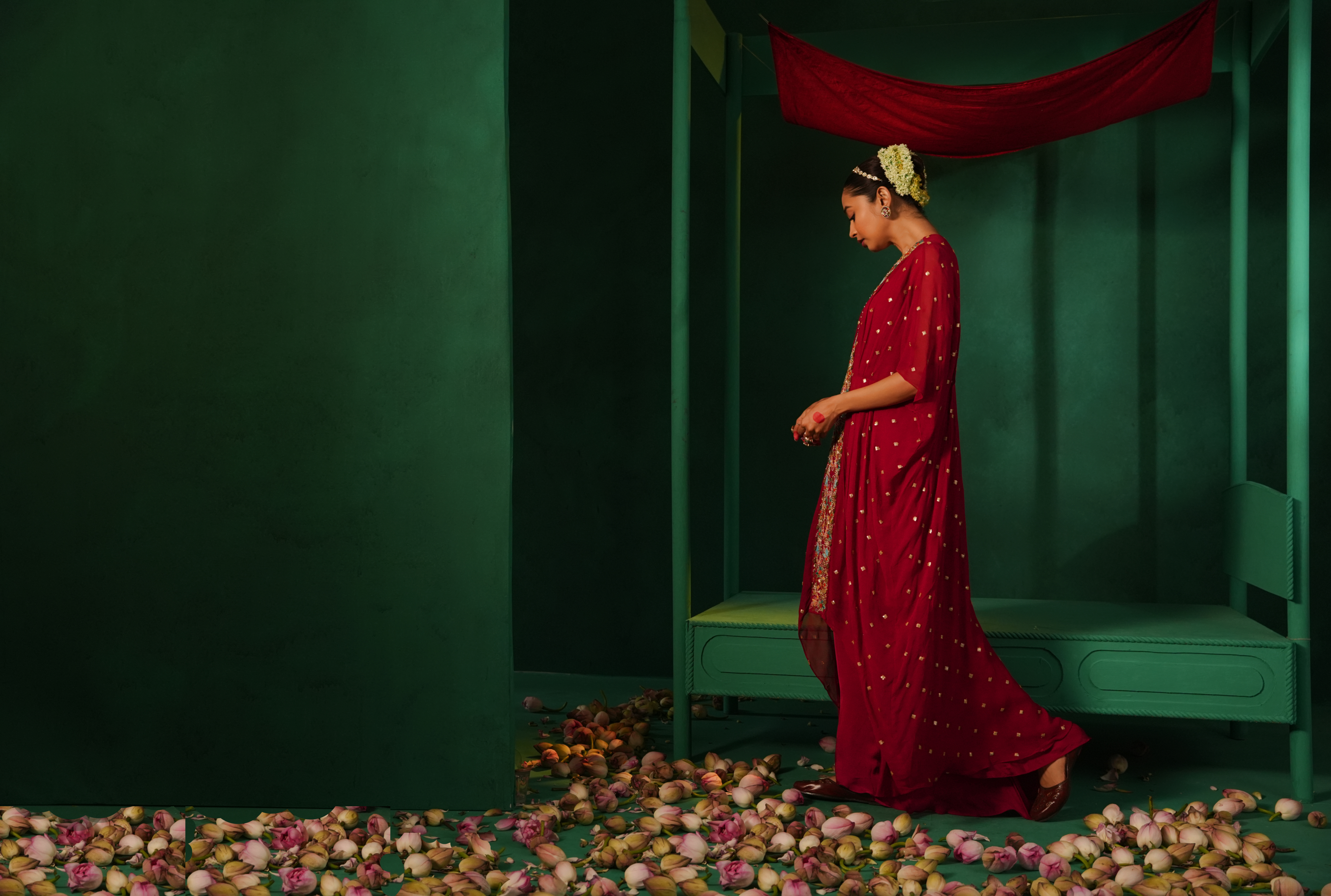
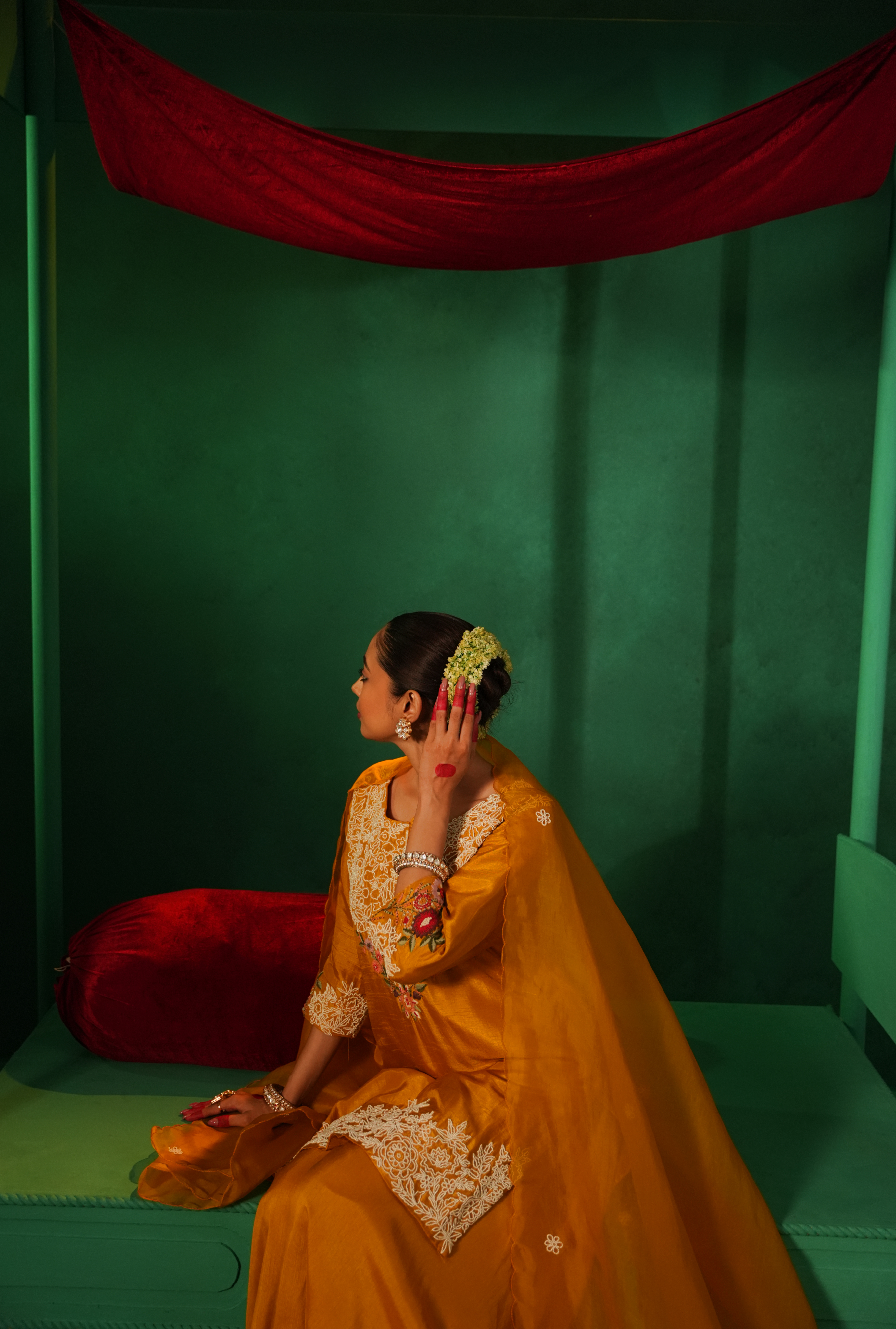
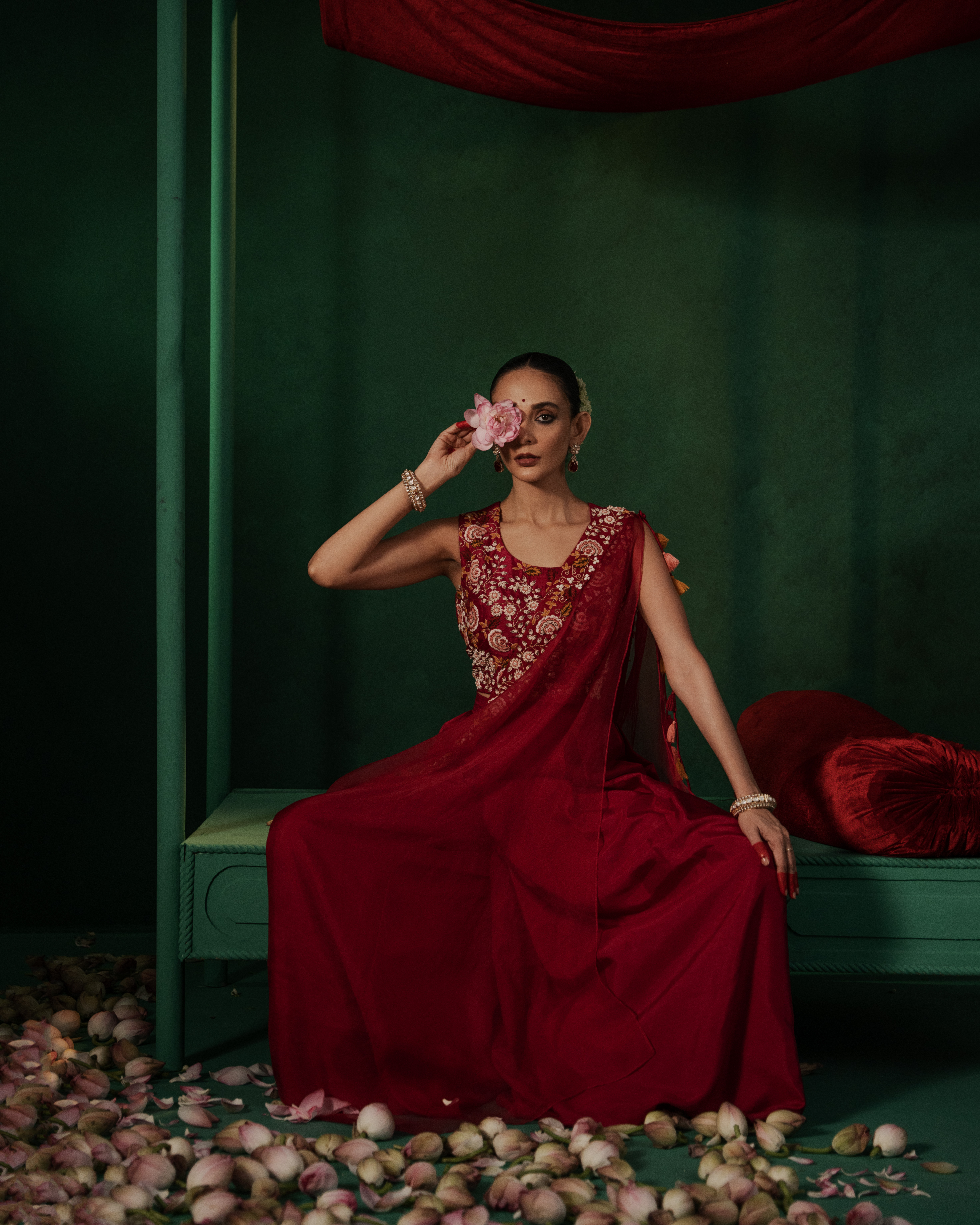
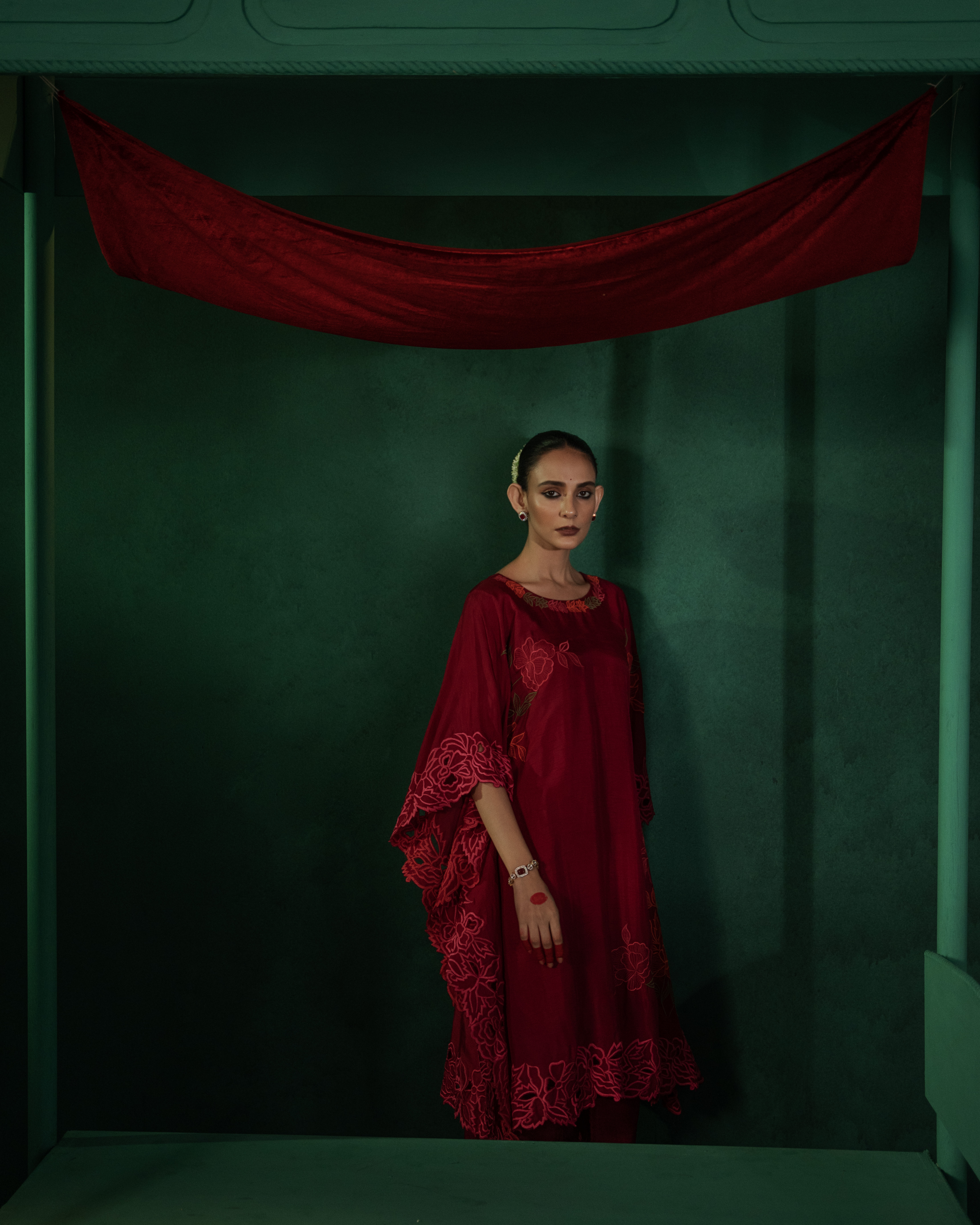
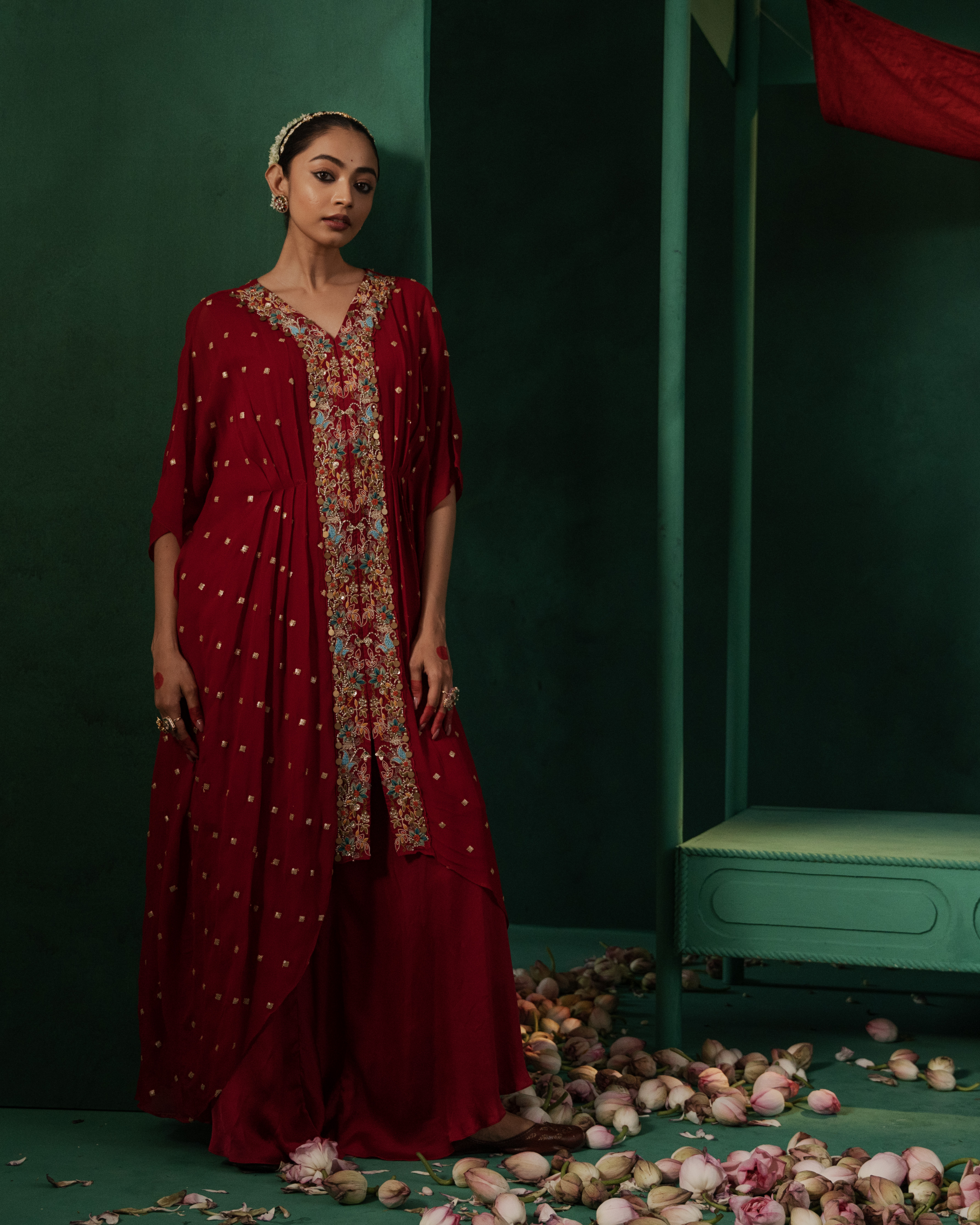
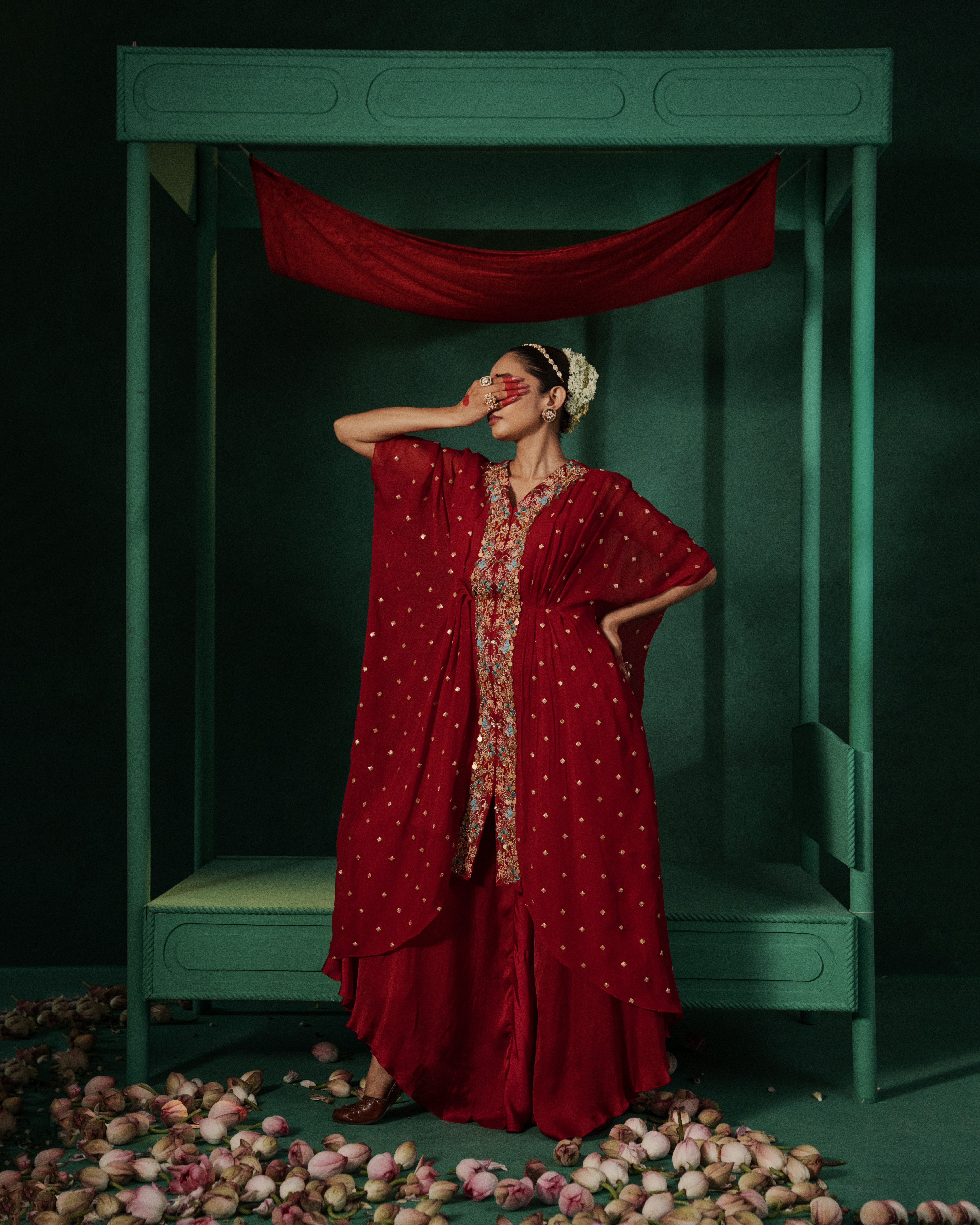
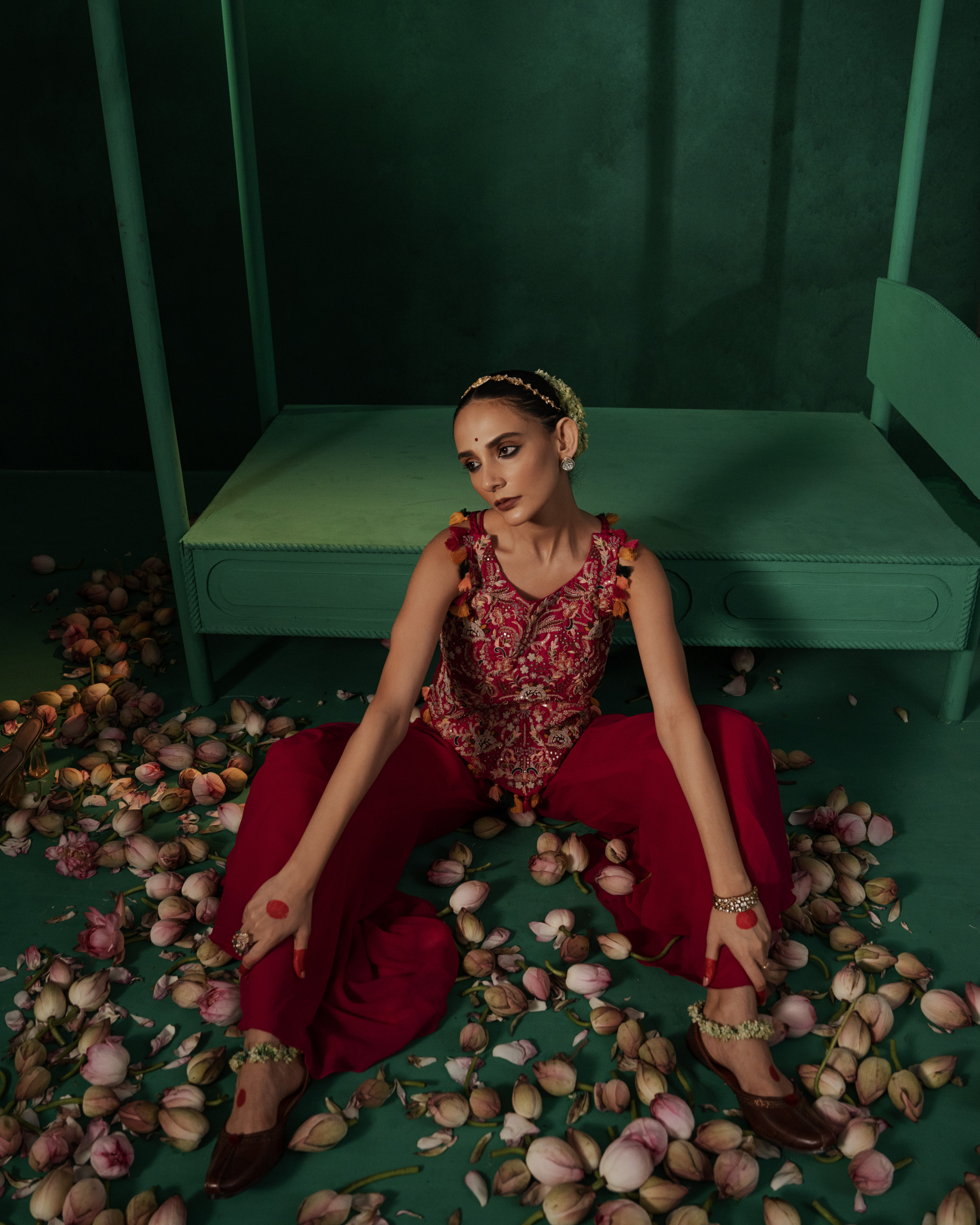
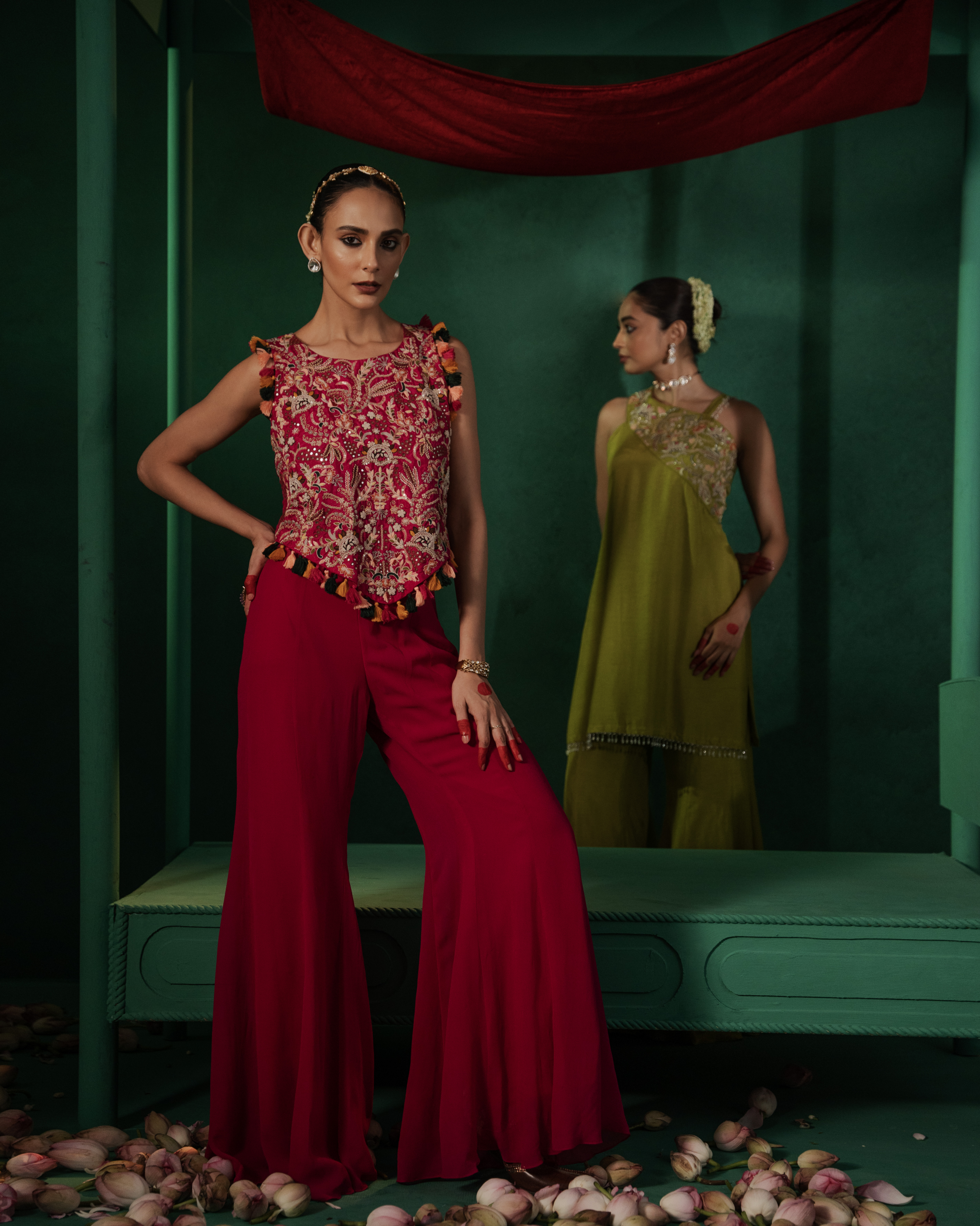
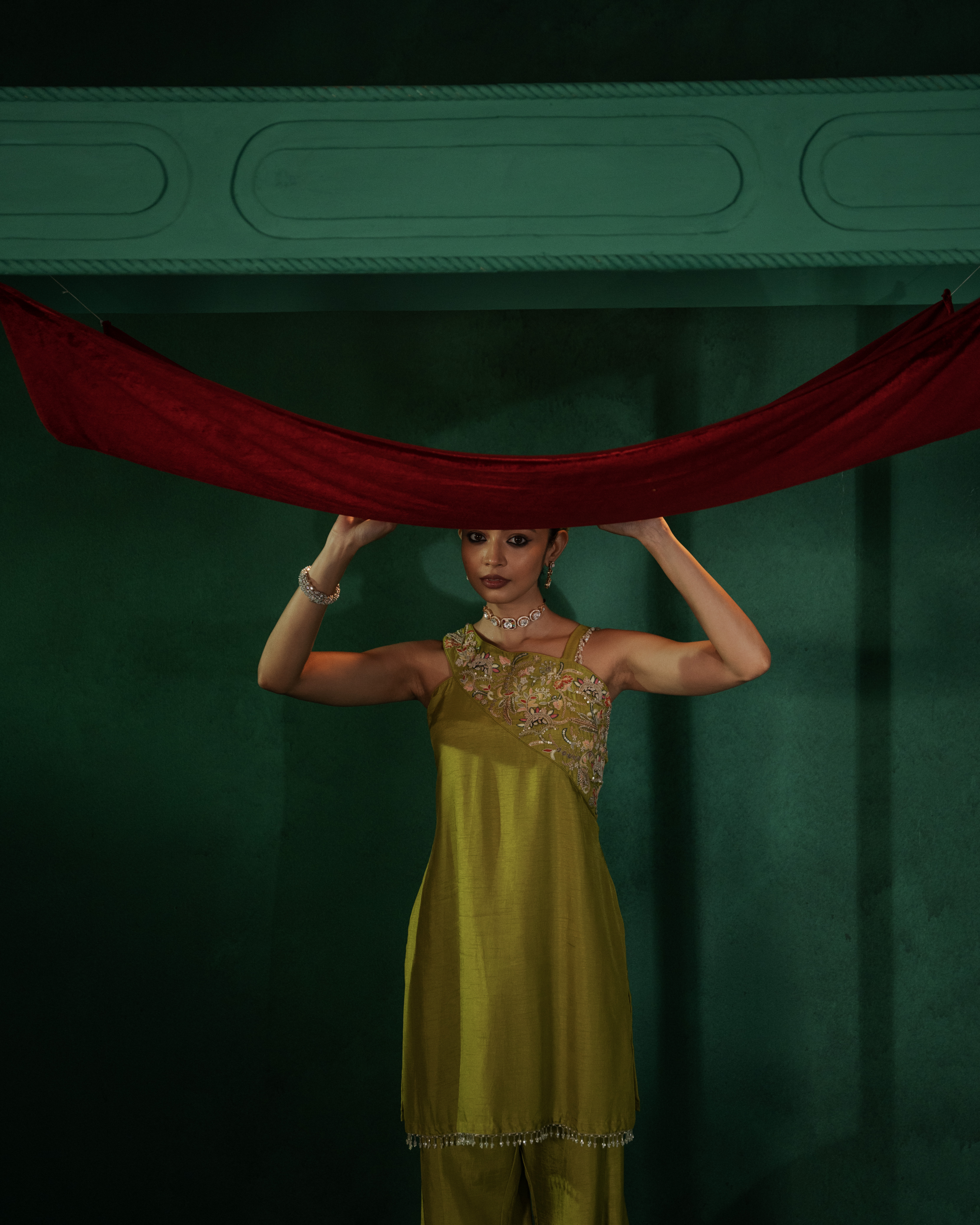
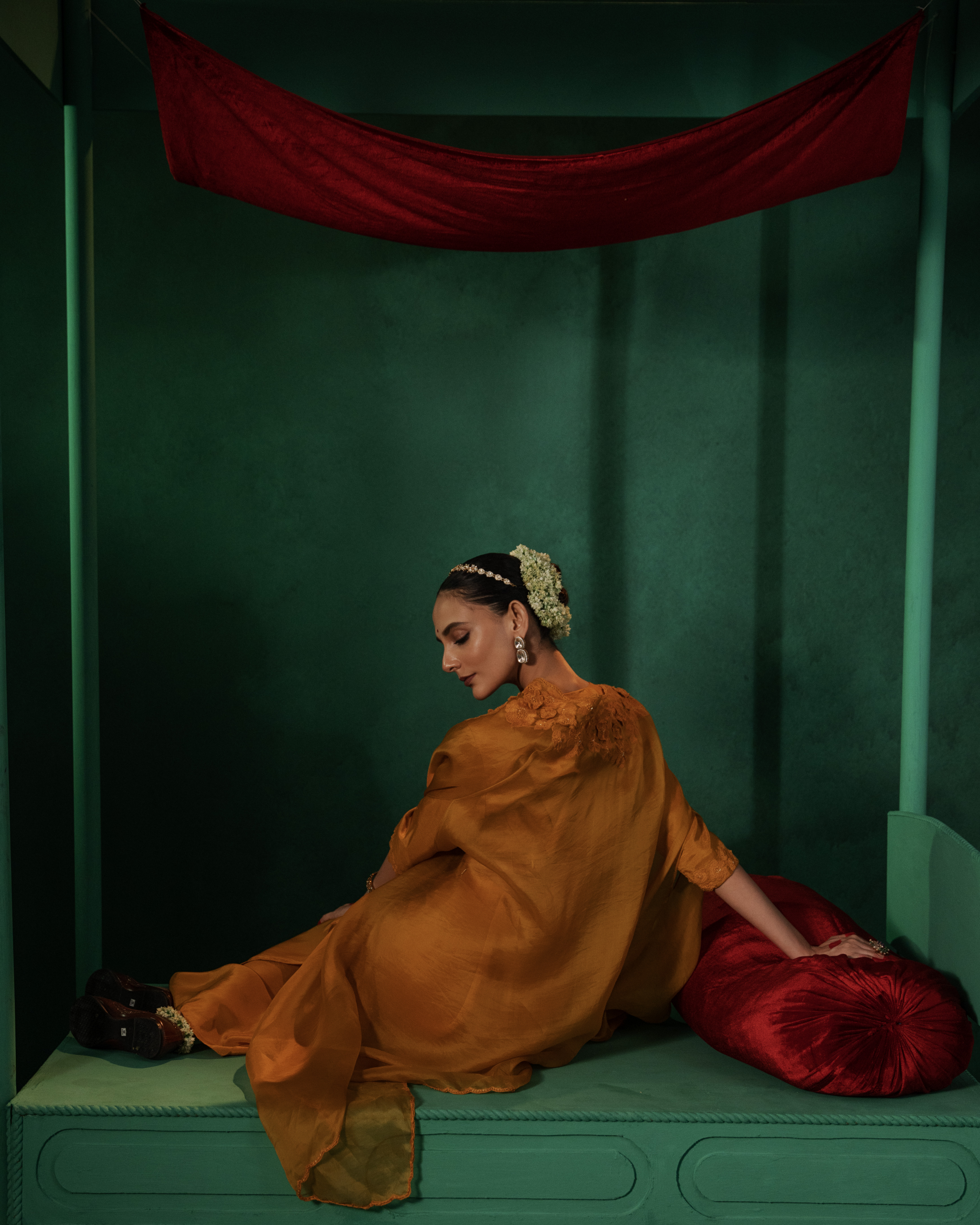
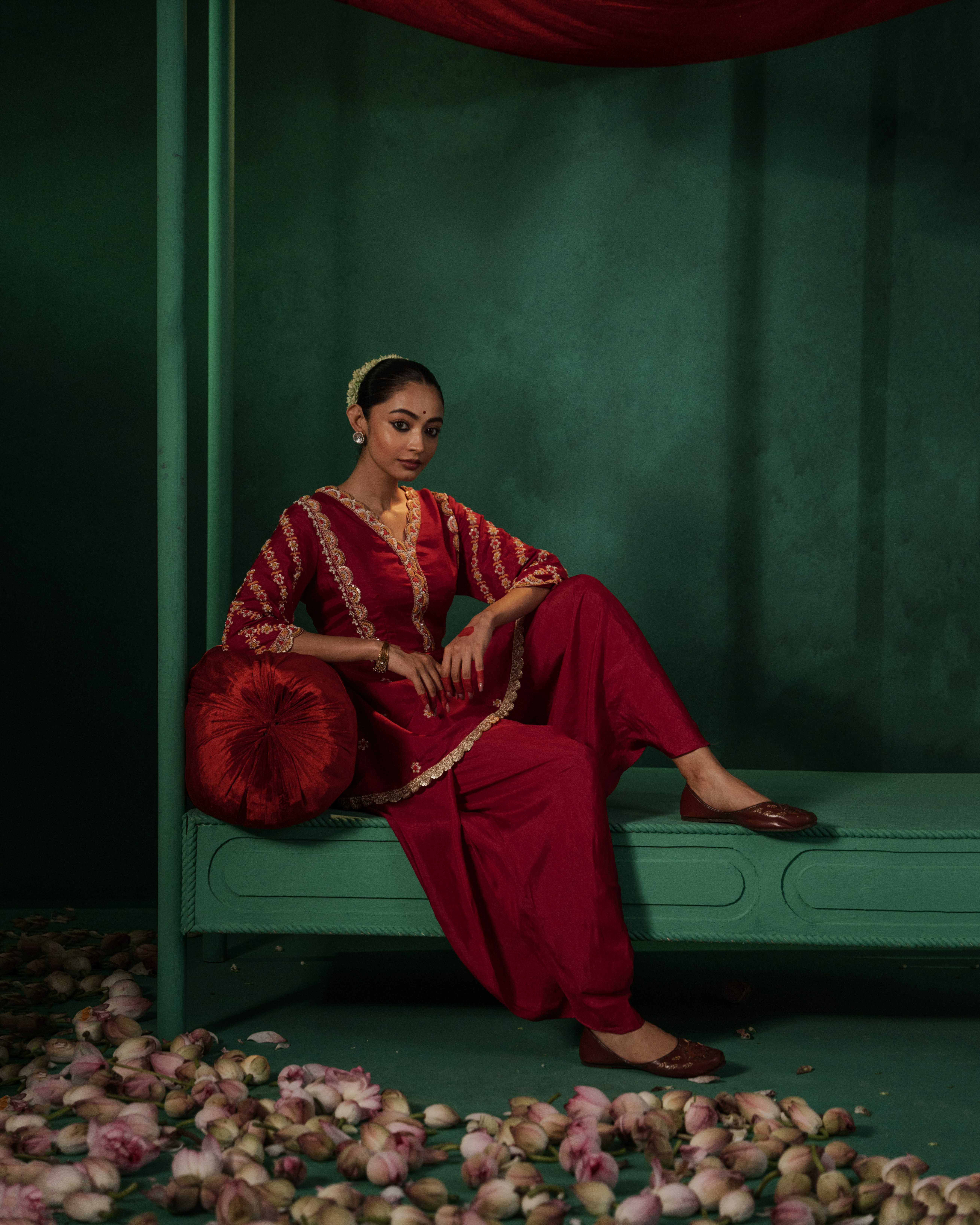
1. Complementary Color TheoryThe most striking reason for this green is the contrast with the red garments. On the color wheel, red and green are complementary. By placing the rich red fabric against a desaturated green background, you make the red "pop" with much more intensity than it would against a neutral white or grey.2. Mood and AtmosphereThe Green: This specific shade of green often evokes a sense of heritage, mystery, and luxury. It’s not a "bright nature" green; it’s a moody, architectural green that gives the shoot a cinematic, editorial feel.The Texture: The background appears to have a matte, slightly weathered texture. This adds a "tangible" quality to the digital image, making it feel more like a physical painting or a high-fashion film set.3. Cultural ResonanceIn the context of Indian fashion photography (implied by the title "PREET" and the "KESAR" credit), this color combination is classic. It mirrors the richness of traditional jewelry and textiles, grounding the modern photography in a timeless, regal aesthetic.4. Visual HierarchyThe background is dark enough to recede, ensuring that the viewer's eye goes straight to the subject (the clothing and the model). The green serves as a "stage" that supports the subject without competing for attention.