
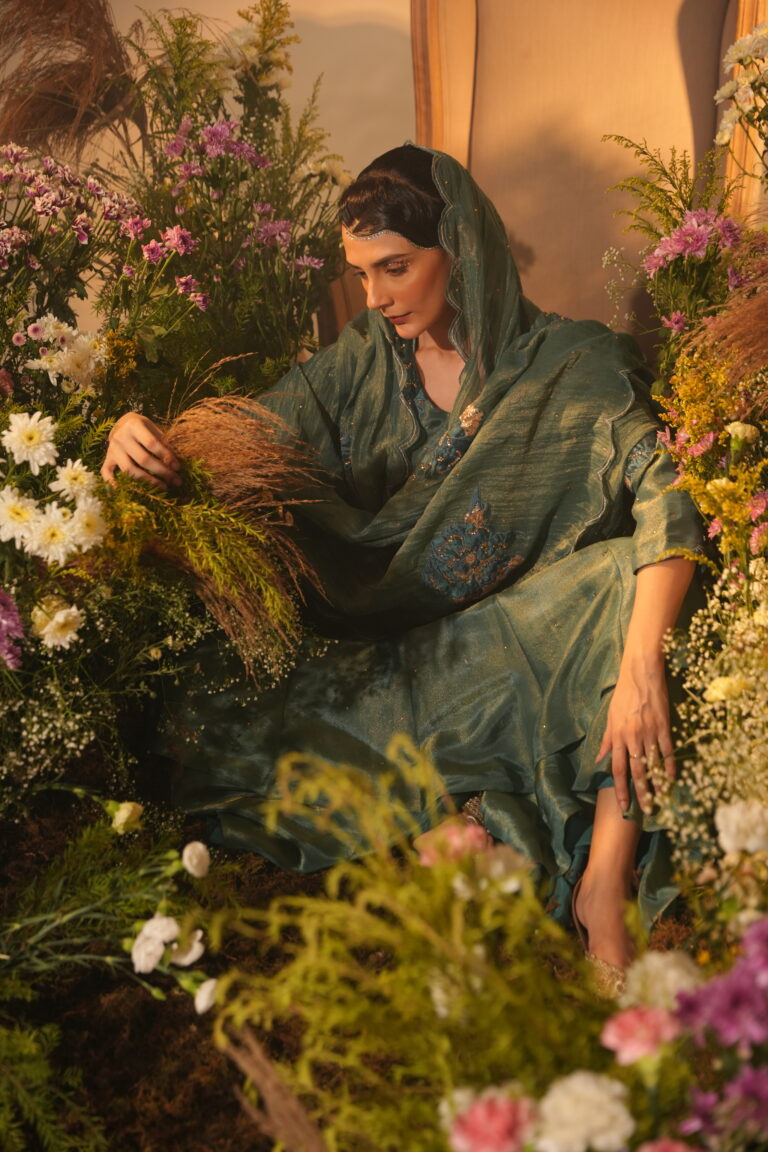
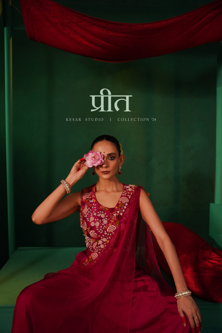
by KESAR 1. Complementary Color TheoryThe most striking reason for this green is the contrast with the red garments. On the color wheel, red and green are complementary. By placing the rich red fabric against a desaturated green background, you make the red “pop” with much more intensity than it would against a neutral white...
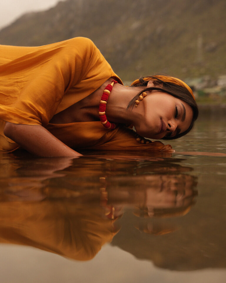
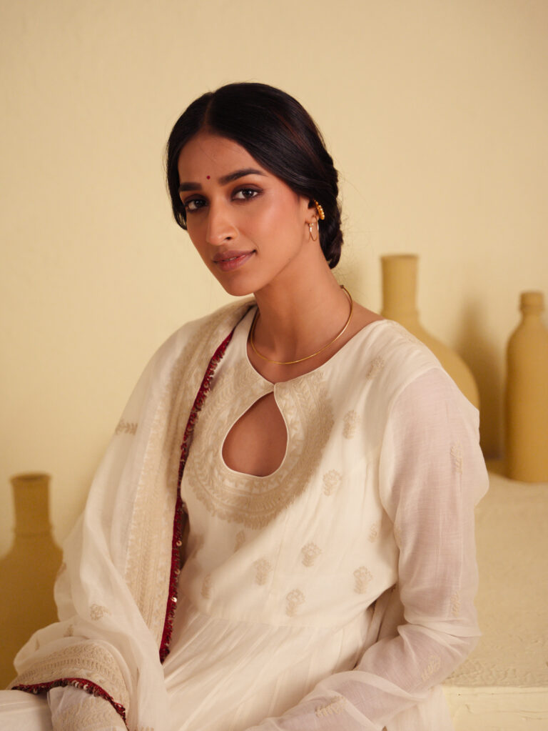
here is why that warm palette works so well:1. Enhancing the “Golden Hour” GlowThe lighting in the photo suggests a late afternoon or sunset setting. By leaning into warm tones (yellows, oranges, and soft reds), you are emphasizing the natural direction of the light. It makes the sun feel more present, even if it’s off-camera,...