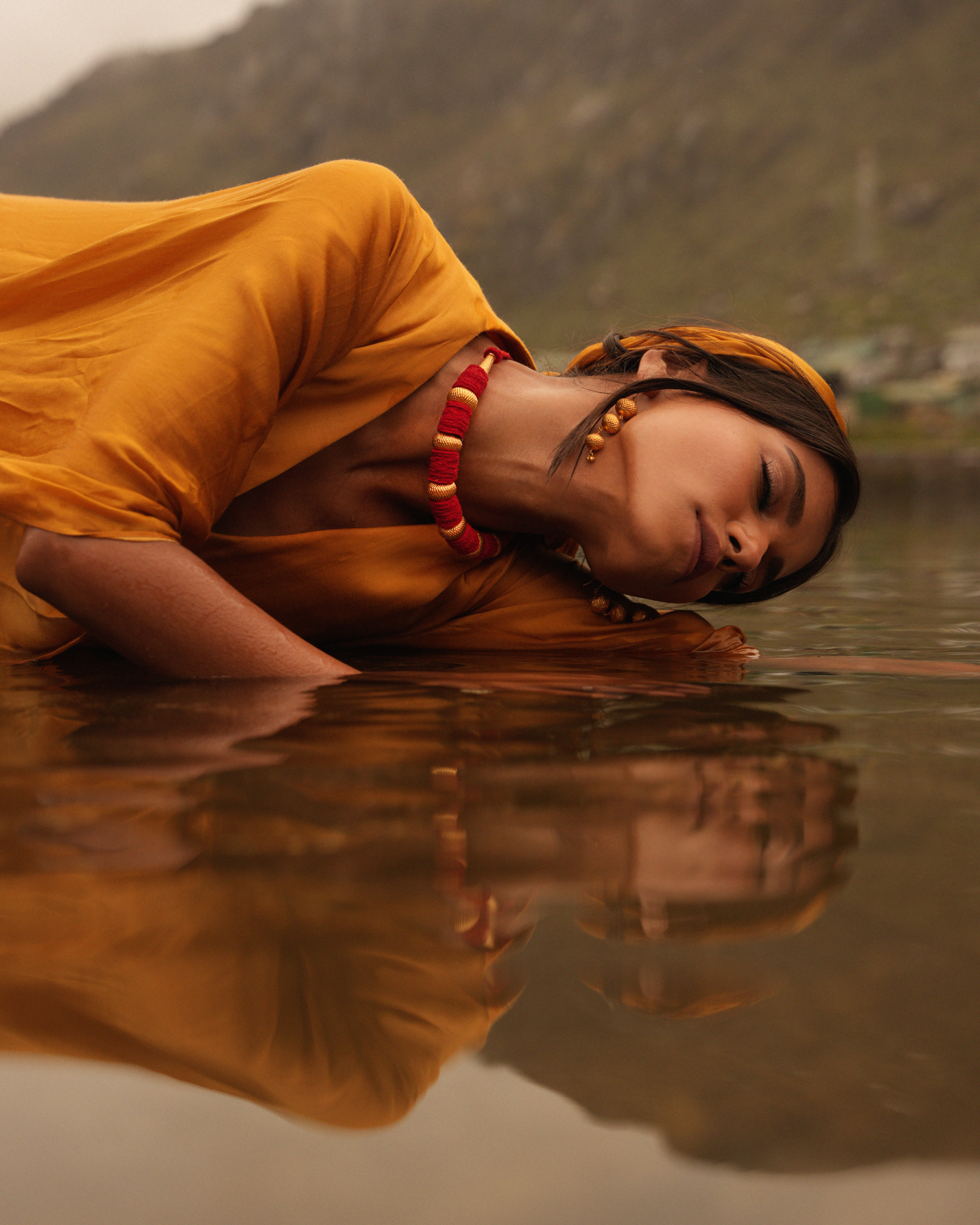
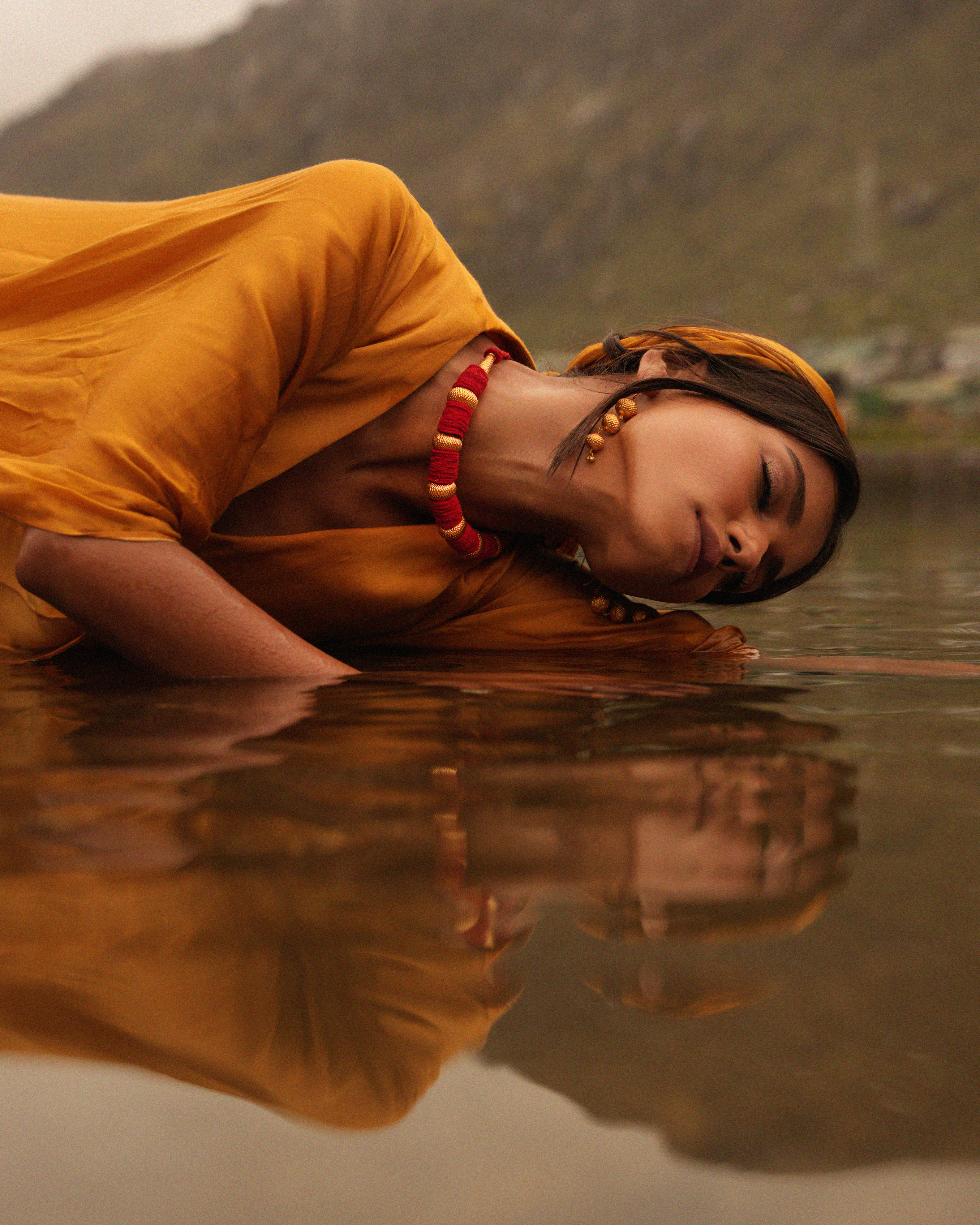
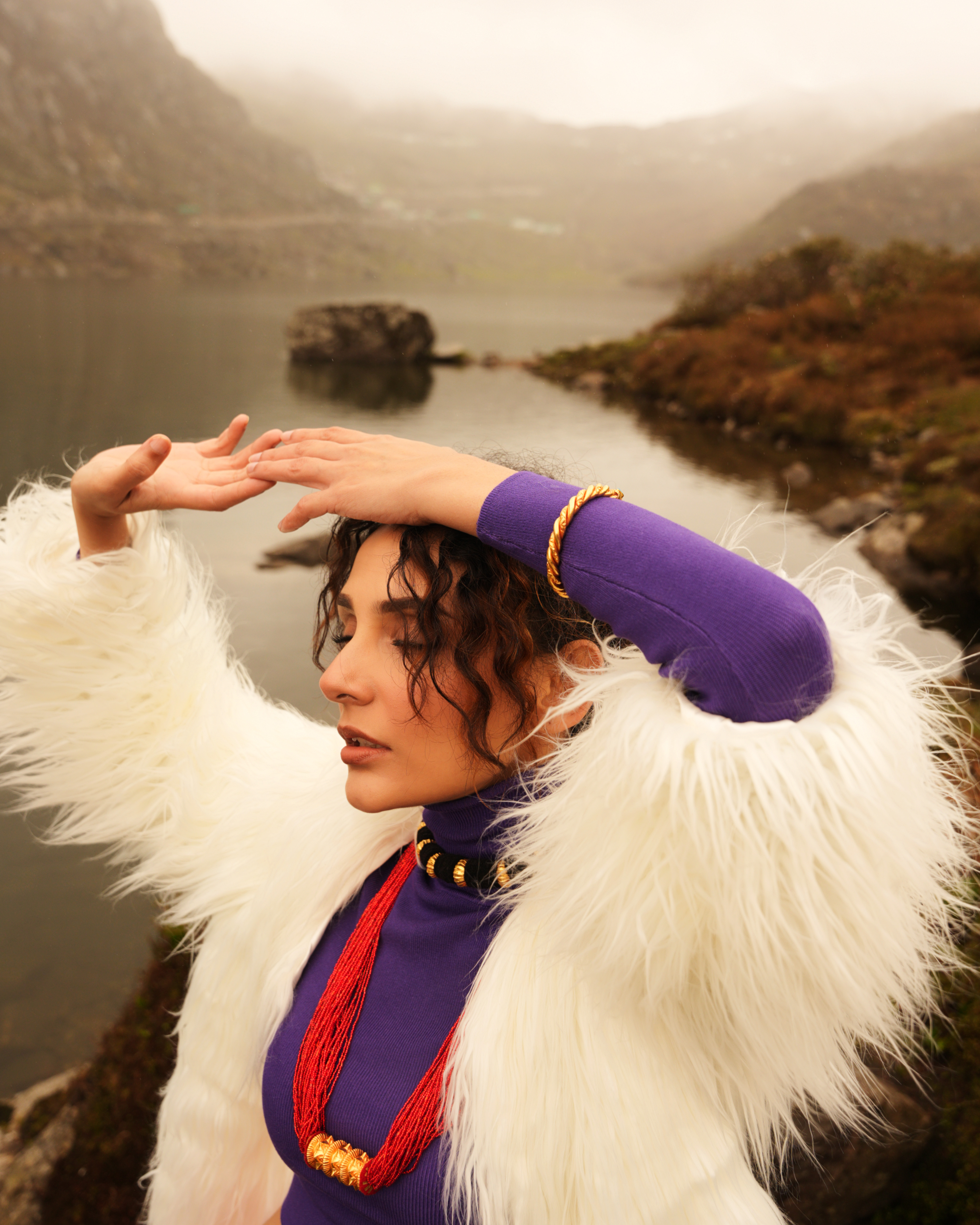
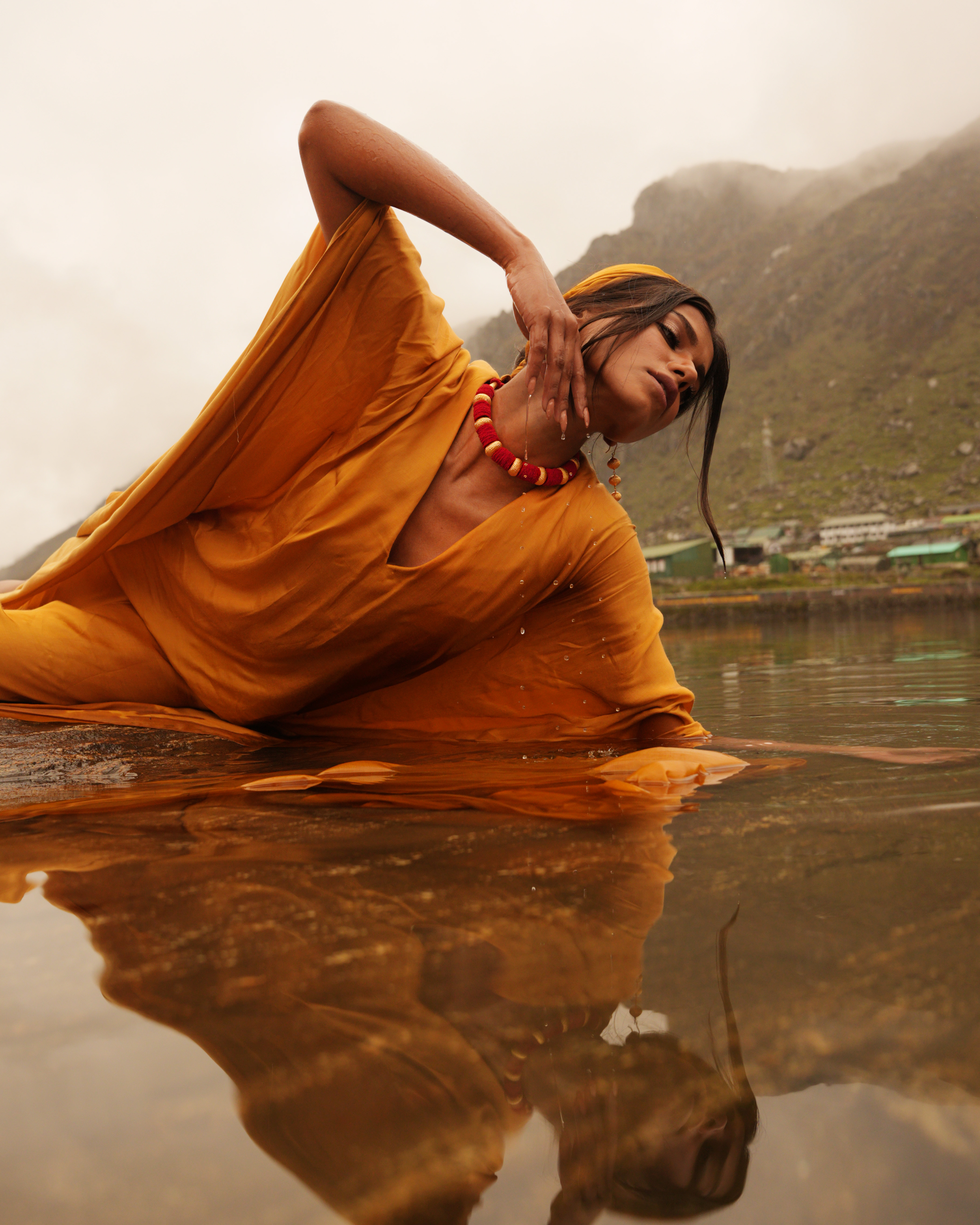

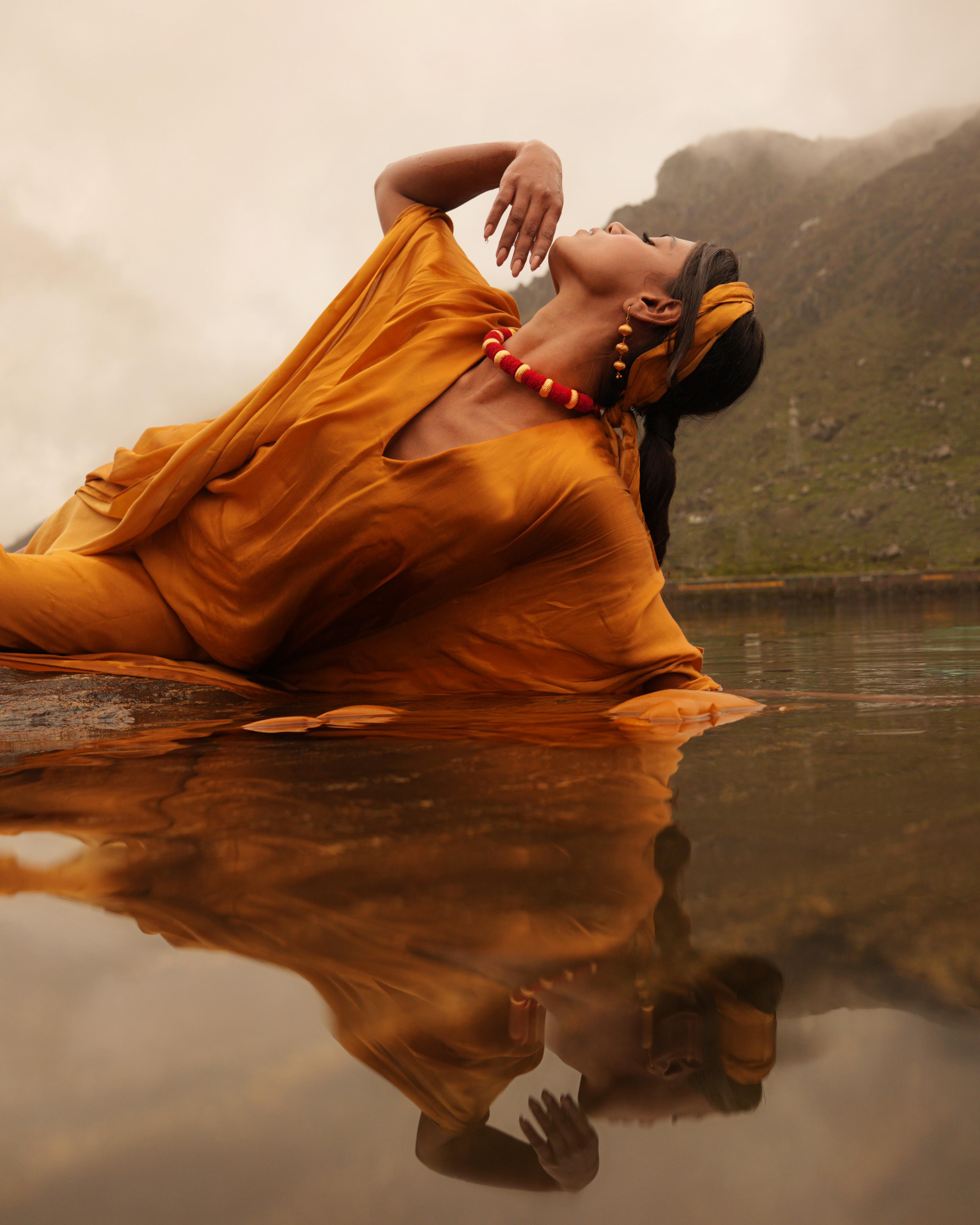

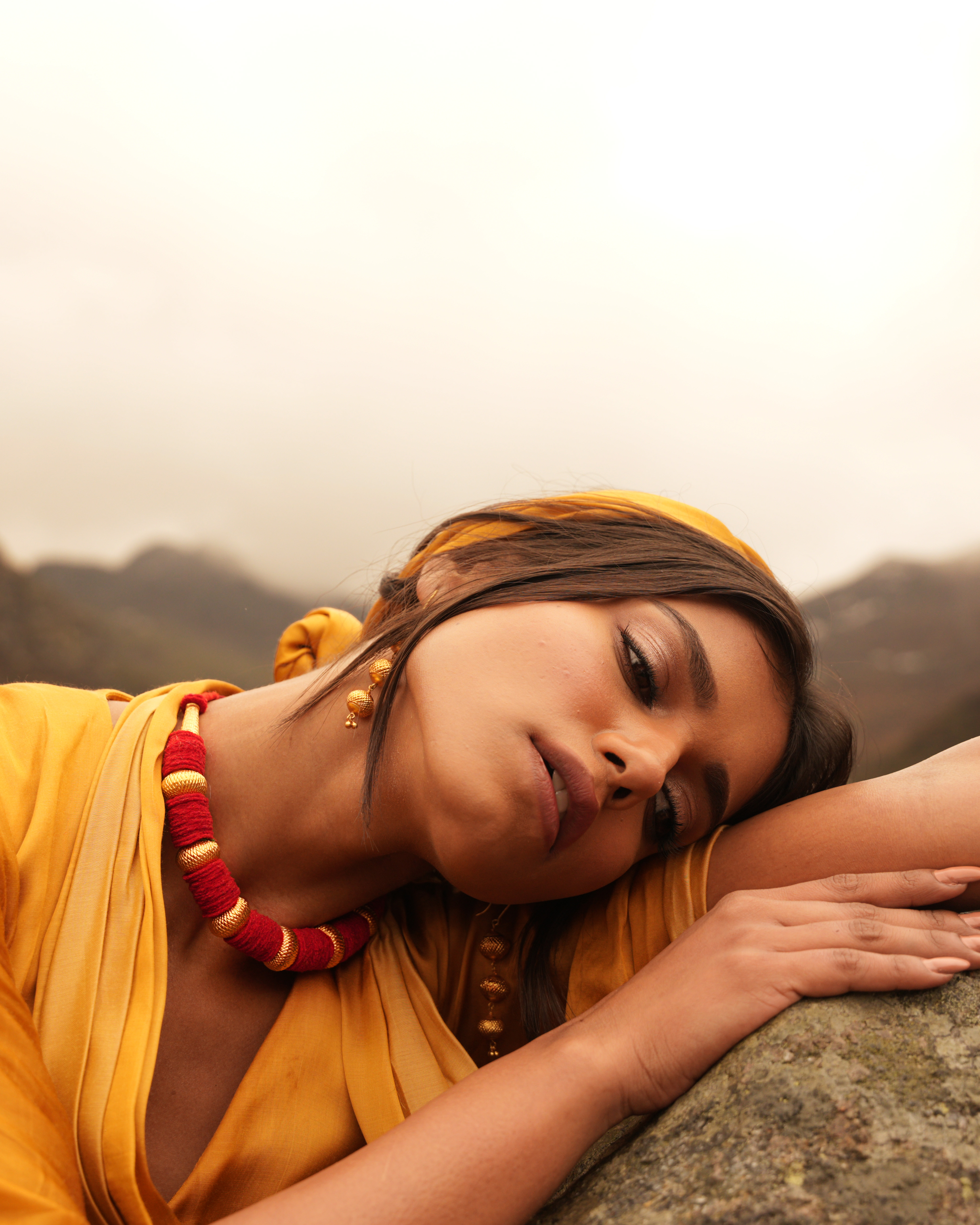

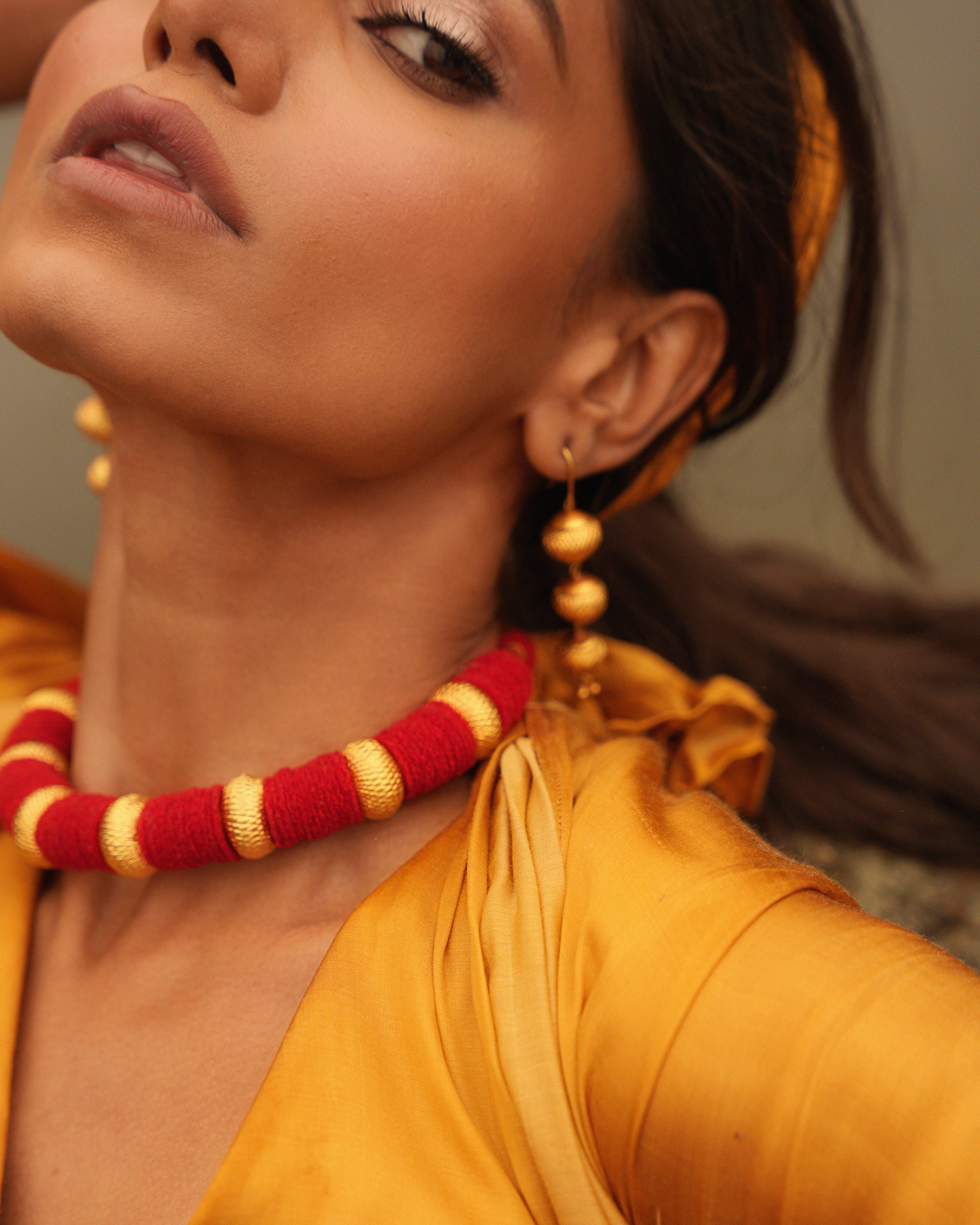
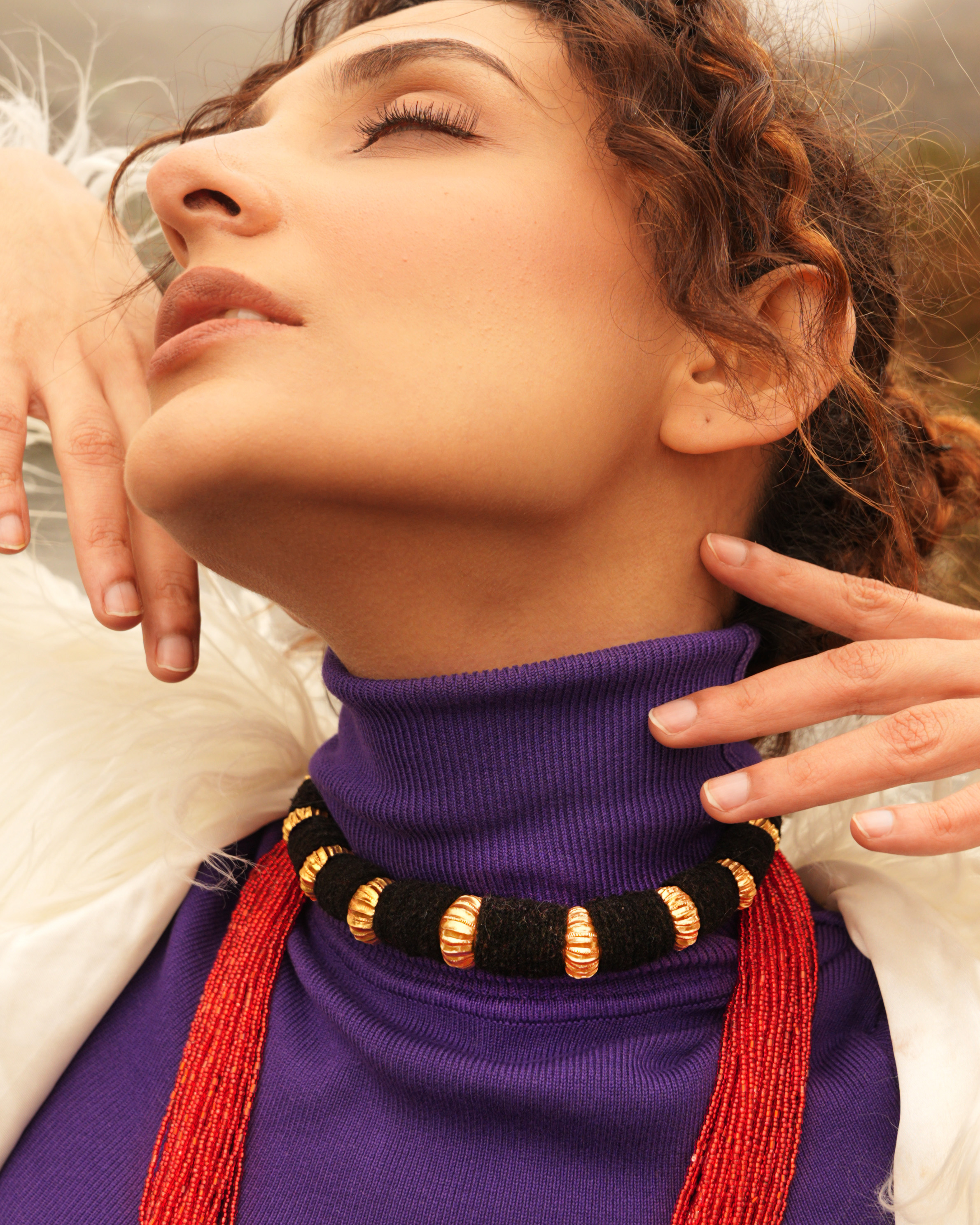


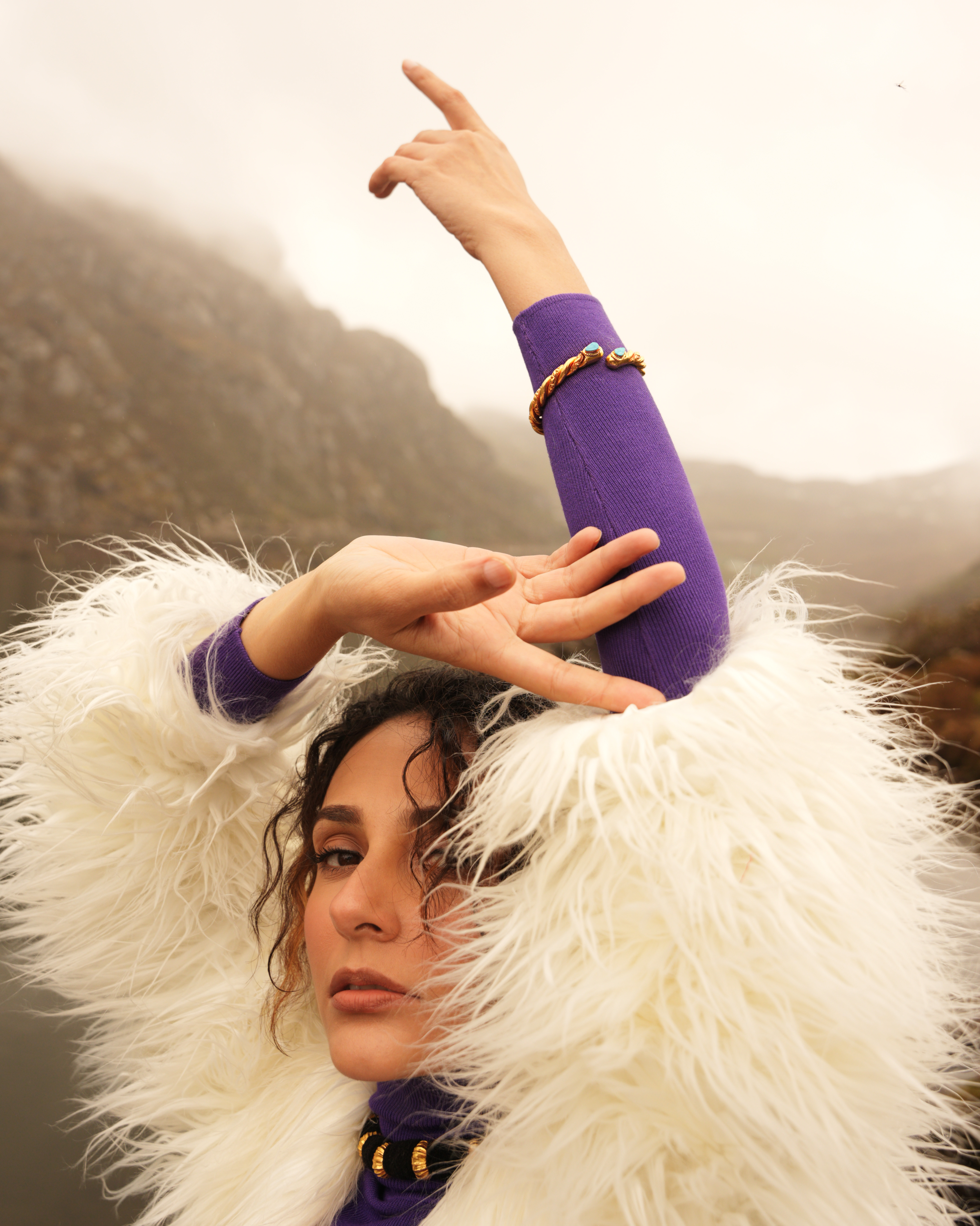
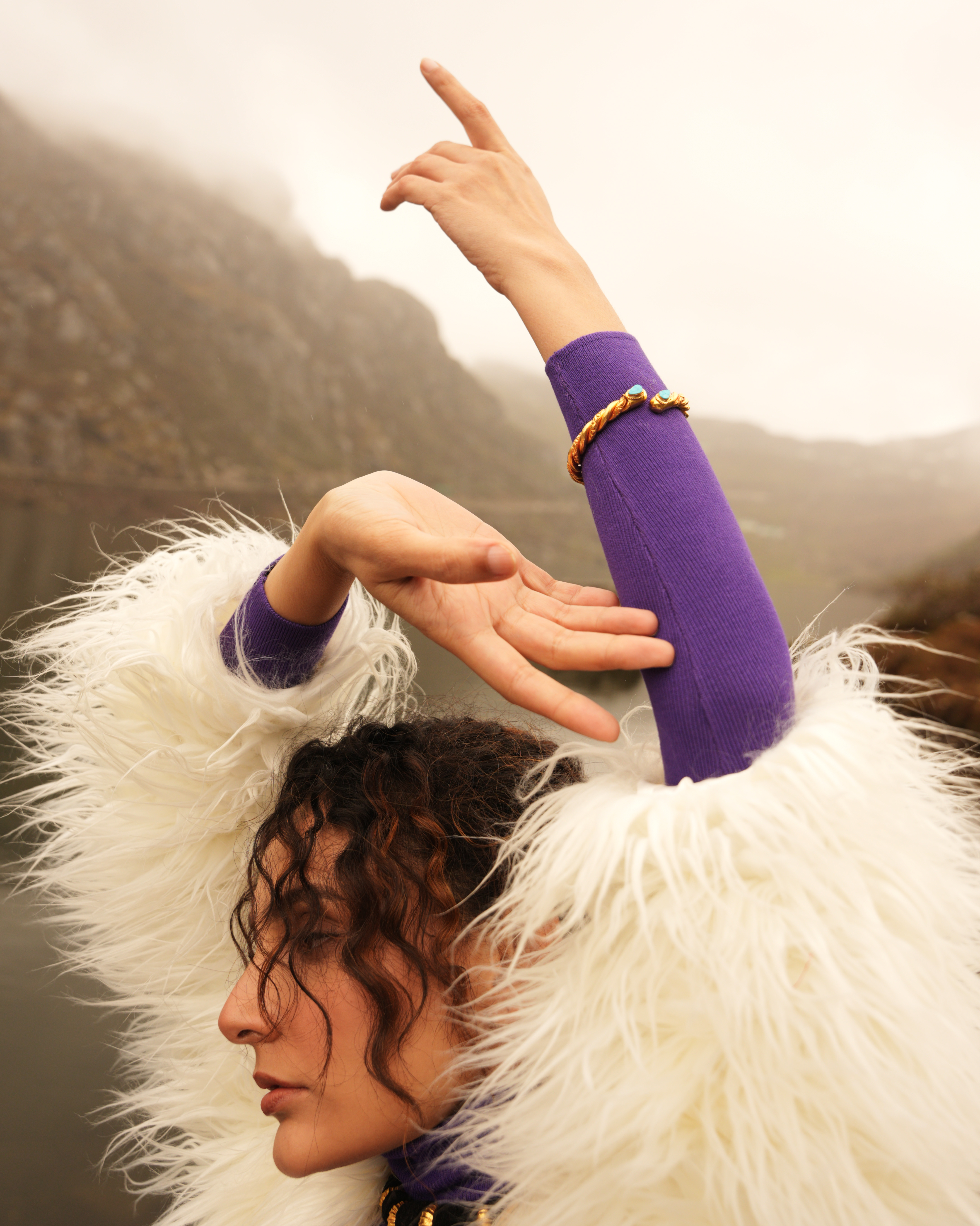
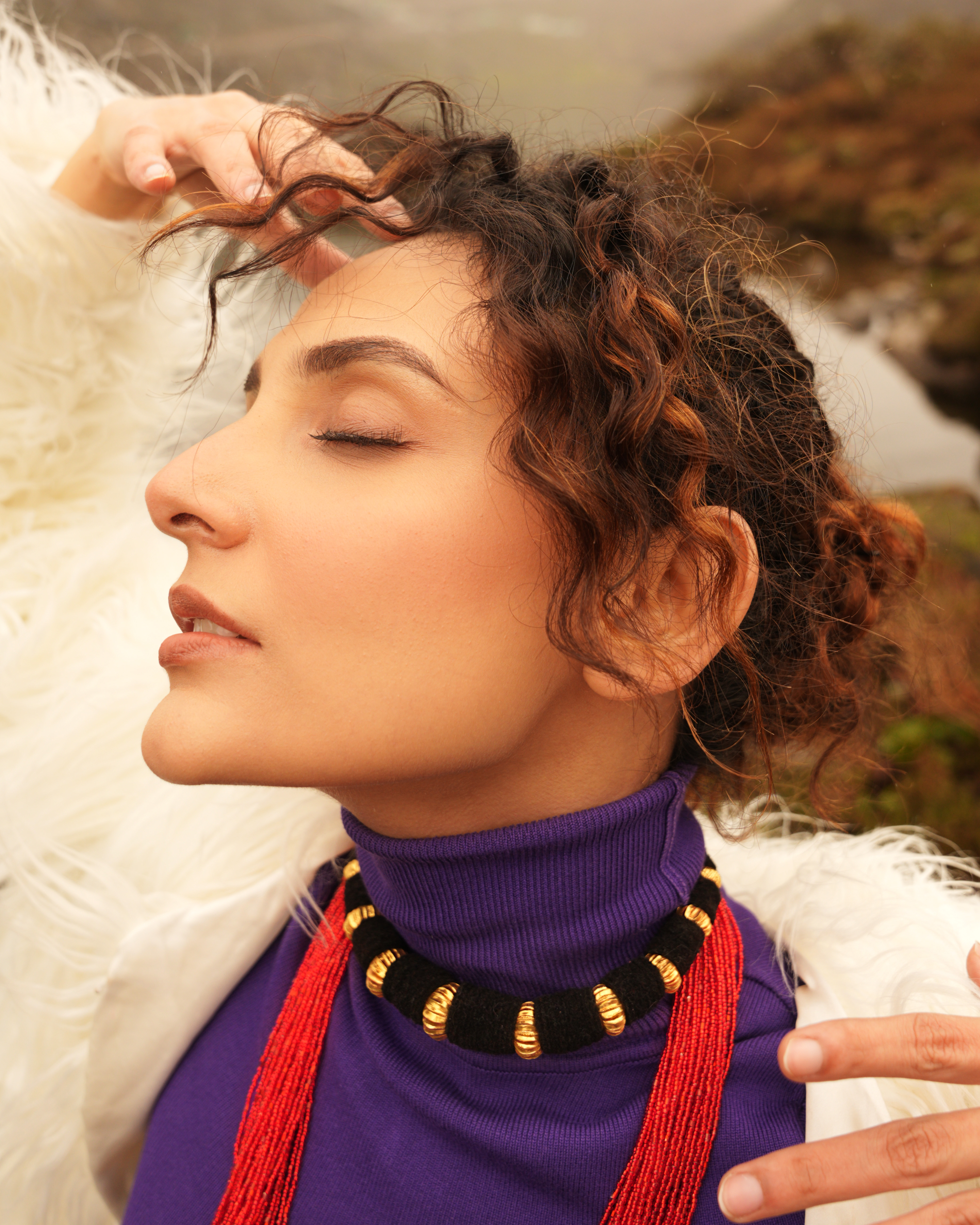
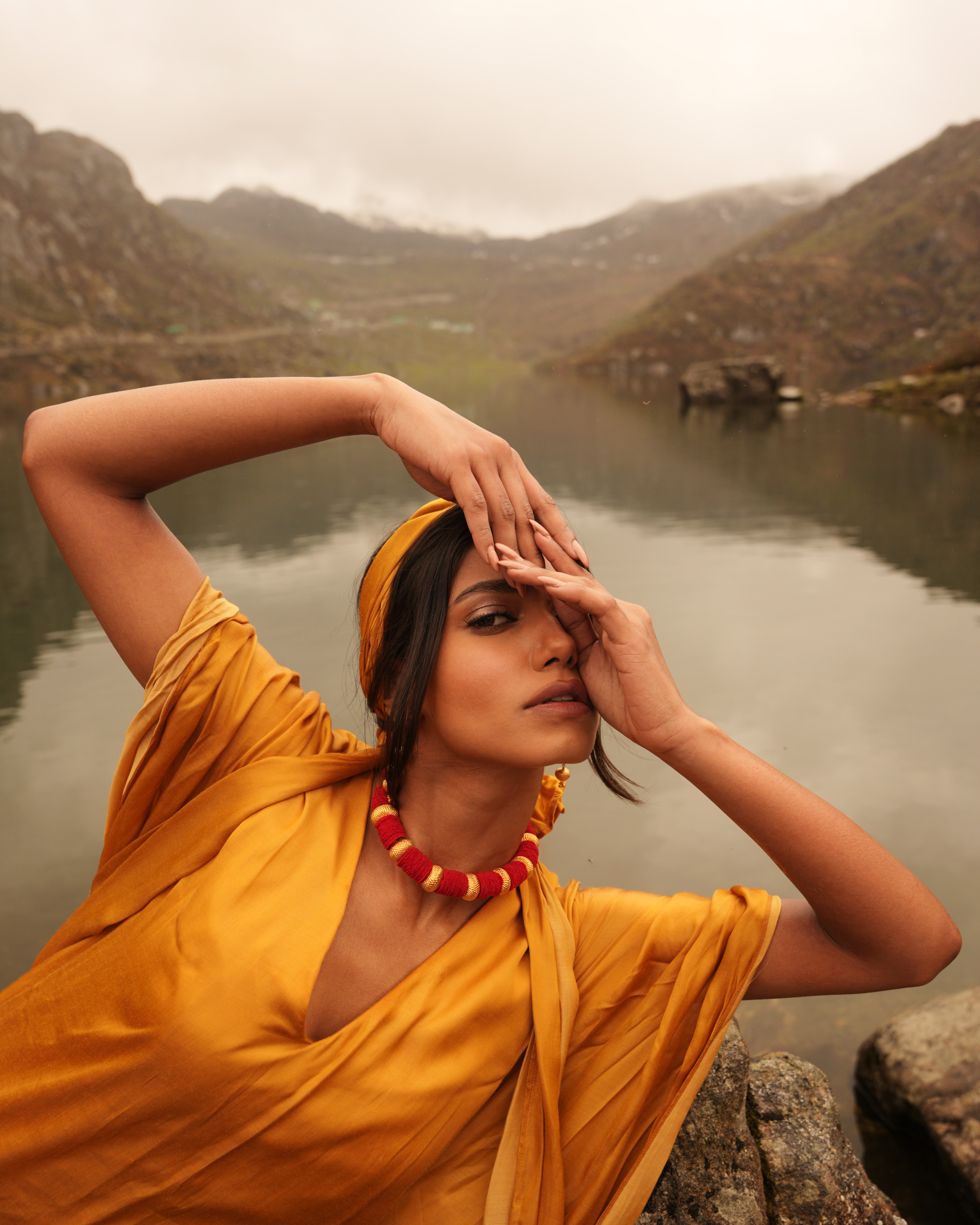
here is why that warm palette works so well:1. Enhancing the "Golden Hour" GlowThe lighting in the photo suggests a late afternoon or sunset setting. By leaning into warm tones (yellows, oranges, and soft reds), you are emphasizing the natural direction of the light. It makes the sun feel more present, even if it's off-camera, creating a cohesive, believable environment.2. Complementing the Subject’s StylingThe subject is wearing a deep mustard/orange garment and a necklace with red accents.Color Harmony: Warm tones create a monochromatic or analogous color scheme.Skin Vitality: Warmth adds a healthy, radiant glow to skin tones, whereas cool tones might have made the subject look pale or washed out against the earthy background.3. Emotional ResonanceWarmth is psychologically tied to specific feelings that match this pose:Intimacy & Nostalgia: The way the subject is leaning toward the water feels personal and quiet. Warmth reinforces that sense of "a golden memory."Comfort: Cool tones (blues/magentas) often feel clinical or "edgy." Warmth makes the viewer feel invited into the scene.4. Interaction with the ReflectionThe reflection in the water is a key element of your composition. Warm tones bridge the gap between the "real" subject and the "mirrored" subject. It turns the water into a liquid amber surface, which feels much more luxurious and artistic than standard, clear water.